A toolbar is used to place a series of buttons, such as toolbarbutton or button. The toolbar buttons could be used without toolbars, so a toolbar could be used without tool buttons. However, tool buttons change their appearance if they are placed inside a toolbar.
The toolbar has two orientation: horizontal and vertical. It controls how the buttons are placed.
See also :
org.zkoss.zul.Button
,
org.zkoss.zul.Toolbarbutton
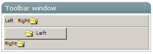
<window title="Toolbar window" border="normal" width="300px">
    <toolbar>
        <toolbarbutton label="Left" /><space/>
        <toolbarbutton label="Right" image="/img/folder.gif" dir="reverse"/>
    </toolbar>
    <toolbar orient="vertical">
        <button label="Left" image="/img/folder.gif" width="125px"/>
        <toolbarbutton label="Right" image="/img/folder.gif" dir="reverse"/>
    </toolbar>
</window>
|
Event Name |
Event Type |
|---|---|
|
|
Description: Denotes user has clicked the component. |
|
onRightClick |
Description: Denotes user has right-clicked the component. |
|
onDoubleClick |
Description: Denotes user has double-clicked the component. |