The behave of Toolbarbutton is similar to the button except the appearance is different. The button component uses HTML BUTTON tag, while thetoolbarbutton component uses HTML A tag.
A toolbarbutton could be placed outside a toolbar, However toolbarbuttons change their appearance if they are placed inside a toolbar.
Toolbarbutton supports getHref(). If getHref() is not null, the onClick handler is ignored and this element is degenerated to HTML's A tag.
See also :
org.zkoss.zul.Button
,
org.zkoss.zul.Toolbar
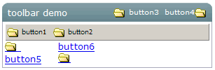
<window title="toolbar demo" border="normal" width="300px">
    <caption>
        <toolbarbutton label="button3" image="/img/folder.gif"/><space/>
        <toolbarbutton label="button4" image="/img/folder.gif" dir="reverse" />
    </caption>
    <toolbar>
        <toolbarbutton label="button1" image="/img/folder.gif" /><space/>
        <toolbarbutton label="button2" image="/img/folder.gif" />
    </toolbar>
    <hbox>
    <toolbarbutton label="button5" image="/img/folder.gif" orient="vertical"/><space/>
    <toolbarbutton label="button6" image="/img/folder.gif" orient="vertical" dir="reverse"/>
    </hbox>
</window>
|
Event Name |
Event Type |
|---|---|
|
|
Description: Denotes user has clicked the component. |
|
onRightClick |
Description: Denotes user has right-clicked the component. |
|
Property |
Description |
Data Type |
Default Value |
|---|---|---|---|
|
|
Sets the direction of image, if normal then text first, otherwise image first. Check
Values : |
|
|
|
|
Sets the href, If |
|
|
|
|
Sets the orient. Check
Values : |
|
|
|
|
Sets the target frame or window, this attribute works when |
|
|