Qt Quick Extras Overview
Qt Quick Extras provide a set of UI controls to create user interfaces in Qt Quick.
Getting Started
Building
If you are building Qt Quick Extras from source, you can follow the steps used for most Qt modules:
qmake
make
make install
Using the Controls
The QML types can be imported into your application using the following import statement in your .qml file.
import QtQuick.Extras 1.4
Interactive controls
A checkable button that triggers an action when held in long enough | |
A circular dial that is rotated to set a value | |
A popup menu that displays several menu items along an arc | |
A push button that toggles between two states | |
A control that can have several spinnable wheels, each with items that can be selected |
Non-interactive controls
A gauge that displays a value within a range along an arc | |
A straight gauge that displays a value within a range | |
An indicator that displays active or inactive states | |
An indicator that displays a colorized QPicture icon |
Creating a basic example
A basic example of a QML file that makes use of controls is shown here:
import QtQuick 2.2
import QtQuick.Extras 1.4

Rectangle {
    DelayButton {
        anchors.centerIn: parent
    }
}
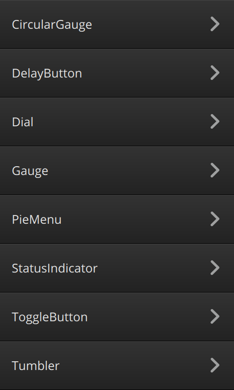
For an interactive showcase of the controls provided by Qt Quick Extras, you can look at the Gallery example.

Related information
© 2017 The Qt Company Ltd. Documentation contributions included herein are the copyrights of their respective owners. The documentation provided herein is licensed under the terms of the GNU Free Documentation License version 1.3 as published by the Free Software Foundation. Qt and respective logos are trademarks of The Qt Company Ltd. in Finland and/or other countries worldwide. All other trademarks are property of their respective owners.
