Yellowbrick: Machine Learning Visualization
Yellowbrick is a suite of visual diagnostic tools called “Visualizers” that extend the Scikit-Learn API to allow human steering of the model selection process. In a nutshell, Yellowbrick combines Scikit-Learn with Matplotlib in the best tradition of the Scikit-Learn documentation, but to produce visualizations for your models! For more on Yellowbrick, please see the About.
If you’re new to Yellowbrick, checkout the Quick Start or skip ahead to the Model Selection Tutorial. Yellowbrick is a rich library with many Visualizers being added on a regular basis. For details on specific Visualizers and extended usage head over to the Visualizers and API. Interested in contributing to Yellowbrick? Checkout the contributing guide . If you’ve signed up to do user testing, head over to the User Testing Instructions (and thank you!).
Visualizers
Visualizers are estimators (objects that learn from data) whose primary objective is to create visualizations that allow insight into the model selection process. In Scikit-Learn terms, they can be similar to transformers when visualizing the data space or wrap an model estimator similar to how the “ModelCV” (e.g. RidgeCV, LassoCV) methods work. The primary goal of Yellowbrick is to create a sensical API similar to Scikit-Learn. Some of our most popular visualizers include:
Feature Visualization
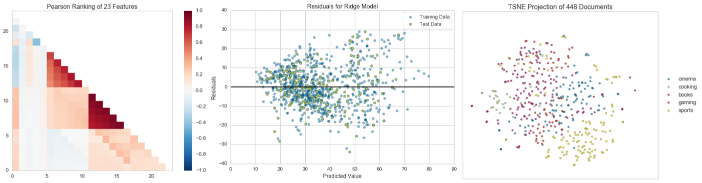
- Rank Features: pairwise ranking of features to detect relationships
- Parallel Coordinates: horizontal visualization of instances
- Radial Visualization: separation of instances around a circular plot
- PCA Projection: projection of instances based on principal components
- Scatter and Joint Plots: direct data visualization with feature selection
Classification Visualization
- Class Balance: see how the distribution of classes affects the model
- Classification Report: visual representation of precision, recall, and F1
- ROC/AUC Curves: receiver operator characteristics and area under the curve
- Confusion Matrices: visual description of class decision making
Regression Visualization
- Prediction Error Plot: find model breakdowns along the domain of the target
- Residuals Plot: show the difference in residuals of training and test data
- Alpha Selection: show how the choice of alpha influences regularization
Clustering Visualization
- K-Elbow Plot: select k using the elbow method and various metrics
- Silhouette Plot: select k by visualizing silhouette coefficient values
Text Visualization
- Term Frequency: visualize the frequency distribution of terms in the corpus
- t-SNE Corpus Visualization: use stochastic neighbor embedding to project documents.
… and more! Visualizers are being added all the time; be sure to check the examples (or even the develop branch) and feel free to contribute your ideas for new Visualizers!
Getting Help
Yellowbrick is a welcoming, inclusive project in the tradition of Matplotlib and Scikit-Learn. Similar to those projects, we try to follow the Python Software Foundation Code of Conduct. Please don’t hesitate to reach out to us for help or if you have any contributions or bugs to report!
The primary way to ask for help with Yellowbrick is to post on our Google Groups Listserv. This is an email list/forum that members of the community can join and respond to each other; you should be able to receive the quickest response here. Please also consider joining the group so you can respond to questions! You can also ask questions on Stack Overflow and tag them with “yellowbrick”. Or you can add issues on GitHub. You can also tweet or direct message us on Twitter @DistrictDataLab.
Open Source
The Yellowbrick license is an open source Apache 2.0 license. Yellowbrick enjoys a very active developer community; please consider joining them and contributing!
Yellowbrick is hosted on GitHub. The issues and pull requests are tracked there.
Table of Contents
The following is a complete listing of the Yellowbrick documentation for this version of the library: