Developer Docs
App Widgets
Widgets are an essential aspect of home screen customization. You can imagine them as "at-a-glance" views of an app's most important data and functionality that is accessible right from the user's home screen. Users can move widgets across their home screen panels, and, if supported, resize them to tailor the amount of information within a widget to their preference.
Widget types
As you begin planning your widget, think about what kind of widget you're trying to build. Widgets typically fall into one of the following categories:
Information widgets
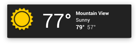
Information widgets typically display a few crucial information elements that are important to a user and track how that information changes over time. Good examples for information widgets are weather widgets, clock widgets or sports score trackers. Touching information widgets typically launches the associated app and opens a detail view of the widget information.
Collection widgets
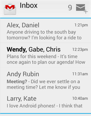
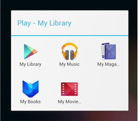
As the name implies, collection widgets specialize in displaying multitude elements of the same type, such as a collection of pictures from a gallery app, a collection of articles from a news app or a collection of emails/messages from a communication app. Collection widgets typically focus on two use cases: browsing the collection, and opening an element of the collection to its detail view for consumption. Collection widgets can scroll vertically.
Control widgets
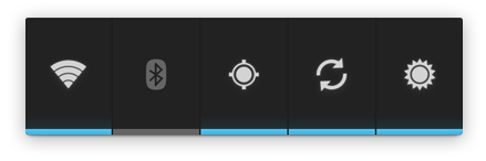
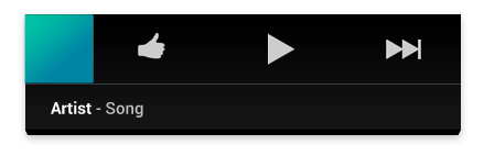
The main purpose of a control widget is to display often used functions that the user can trigger right from the home screen without having to open the app first. Think of them as remote controls for an app. A typical example of control widgets are music app widgets that allow the user to play, pause or skip music tracks from outside the actual music app.
Interacting with control widgets may or may not progress to an associated detail view depending on if the control widget's function generated a data set, such as in the case of a search widget.
Hybrid widgets
While all widgets tend to gravitate towards one of the three types described above, many widgets in reality are hybrids that combine elements of different types.
For the purpose of your widget planning, center your widget around one of the base types and add elements of other types if needed.
Widget limitations
While widgets could be understood as "mini apps", there are certain limitations that are important to understand before you start to embark on designing your widget:
Gestures
Because widgets live on the home screen, they have to co-exist with the navigation that is established there. This limits the gesture support that is available in a widget compared to a full-screen app. While apps for example may support a view pager that allows the user to navigate between screens laterally, that gesture is already taken on the home screen for the purpose of navigating between home panels.
The only gestures available for widgets are:
- Touch
- Vertical swipe
Elements
Given the above interaction limitations, some of the UI building blocks that rely on restricted gestures are not available for widgets. For a complete list of supported building blocks and more information on layout restrictions, please refer to the "Creating App Widget Layouts" section in the App Widgets API Guide.
Design guidelines
Widget content
Widgets are a great mechanism to attract a user to your app by "advertising" new and interesting content that is available for consumption in your app.
Just like the teasers on the front page of a newspaper, widgets should consolidate and concentrate an app's information and then provide a connection to richer detail within the app; or in other words: the widget is the information "snack" while the app is the "meal." As a bottom line, always make sure that your app shows more detail about an information item than what the widget already displays.
Widget navigation
Besides the pure information content, you should also consider to round out your widget's offering by providing navigation links to frequently used areas of your app. This lets users complete tasks quicker and extends the functional reach of the app to the home screen.
Good candidates for navigation links to surface on widgets are:
- Generative functions: These are the functions that allow the user to create new content for an app, such as creating a new document or a new message.
- Open application at top level: Tapping on an information element will usually navigate the user to a lower level detail screen. Providing access to the top level of your application provides more navigation flexibility and can replace a dedicated app shortcut that users would otherwise use to navigate to the app from the home screen. Using your application icon as an affordance can also provide your widget with a clear identity in case the data you're displaying is ambiguous.
Widget resizing
With version 3.1, Android introduced resizable widgets to the platform. Resizing allows users to adjust the height and/or the width of a widget within the constraints of the home panel placement grid. You can decide if your widget is freely resizable or if it is constrained to horizontal or vertical size changes. You do not have to support resizing if your particular widget is inherently fixed-size.
Allowing users to resize widgets has important benefits:
- They can fine-tune how much information they want to see on each widget.
- They can better influence the layout of widgets and shortcuts on their home panels.
Planning a resize strategy for your widget depends on the type of widget you're creating. List or grid-based collection widgets are usually straightforward because resizing the widget will simply expand or contract the vertical scrolling area. Regardless of the of the widget's size, the user can still scroll all information elements into view. Information widgets on the other hand require a bit more hands-on planning, since they are not scrollable and all content has to fit within a given size. You will have to dynamically adjust your widget's content and layout to the size the user defined through the resize operation.

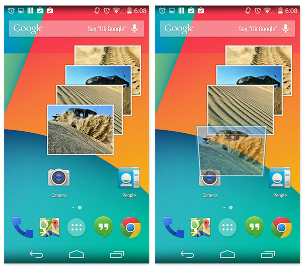
In this simple example the user can horizontally resize a weather widget in 4 steps and expose richer information about the weather at the current location as the widget grows.
For each widget size determine how much of your app's information should surface. For smaller sizes concentrate on the essential and then add more contextual information as the widget grows horizontally and vertically.
Layout considerations
It will be tempting to layout your widgets according to the dimensions of the placement grid of a particular device that you own and develop with. This can be a useful initial approximation as you layout your widget, but keep the following in mind:
- The number, size and spacing of cells can vary widely from device to device, and hence it is very important that your widget is flexible and can accommodate more or less space than anticipated.
- In fact, as the user resizes a widget, the system will respond with a dp size range in which your widget can redraw itself. Planning your widget resizing strategy across "size buckets" rather than variable grid dimensions will give you the most reliable results.
Widget configuration
Sometimes widgets need to be setup before they can become useful. Think of an email widget for example, where you need to provide an account before the inbox can be displayed. Or a static photo widget where the user has to assign the picture that is to be displayed from the gallery.
Android widgets display their configuration choices right after the widget is dropped onto a home panel. Keep the widget configuration light and don't present more than 2-3 configuration elements. Use dialog-style instead of full-screen activities to present configuration choices and retain the user's context of place, even if doing so requires use of multiple dialogs.
Once setup, there typically is not a lot of reason to revisit the setup. Therefore Android widgets do not show a "Setup" or "Configuration" button.
Checklist
- Focus on small portions of glanceable information on your widget. Expand on the information in your app.
- Choose the right widget type for your purpose.
- For resizable widgets, plan how the content for your widget should adapt to different sizes.
- Make your widget orientation and device independent by ensuring that the layout is capable of stretching and contracting.