Keyboard Focus in QML
When a key is pressed or released, a key event is generated and delivered to the focused QML Item. To facilitate the construction of reusable components and to address some of the cases unique to fluid user interfaces, the QML items add a scope based extension to Qt's traditional keyboard focus model.
Key Handling Overview
When the user presses or releases a key, the following occurs:
- Qt receives the key action and generates a key event.
- If the Qt widget containing the QDeclarativeView has focus, the key event is delivered to it. Otherwise, regular Qt key handling continues.
- The key event is delivered by the scene to the QML Item with active focus. If no Item has active focus, the key event is ignored and regular Qt key handling continues.
- If the QML Item with active focus accepts the key event, propagation stops. Otherwise the event is "bubbled up", by recursively passing it to each Item's parent until either the event is accepted, or the root Item is reached.
If the Rectangle element in the following example has active focus and the A key is pressed, it will bubble up to its parent. However, pressing the B key will bubble up to the root item and thus subsequently be ignored.
Item { Item { Keys.onPressed: { if (event.key == Qt.Key_A) { console.log('Key A was pressed'); event.accepted = true; } } Rectangle {} } } - If the root Item is reached, the key event is ignored and regular Qt key handling continues.
See also the Keys attached property and KeyNavigation attached property.
Querying the Active Focus Item
Whether or not an Item has active focus can be queried through the property Item::activeFocus. For example, here we have a Text element whose text is determined by whether or not it has active focus.
 Text {
     text: activeFocus ? "I have active focus!" : "I do not have active focus"
 }
Acquiring Focus and Focus Scopes
An Item requests focus by setting the Item::focus property to true.
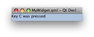
For very simple cases simply setting the Item::focus property is sometimes sufficient. If we run the following example with the QML Viewer, we see that the keyHandler element has active focus and pressing the 'A', 'B' or 'C' keys modifies the text appropriately.
     Rectangle {
         color: "lightsteelblue"; width: 240; height: 25
         Text { id: myText }
         Item {
             id: keyHandler
             focus: true
             Keys.onPressed: {
                 if (event.key == Qt.Key_A)
                     myText.text = 'Key A was pressed'
                 else if (event.key == Qt.Key_B)
                     myText.text = 'Key B was pressed'
                 else if (event.key == Qt.Key_C)
                     myText.text = 'Key C was pressed'
             }
         }
     }
|
|
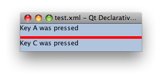
However, were the above example to be used as a self-contained component, this simple use of the Item::focus property is no longer sufficient. The left hand side of the following table shows what we would like to be able to write. Here we create two instances of our previously defined component, and set the second one to have focus. The intention is that when the A, B, or C keys are pressed, the second of the two components receives the event and reponds accordingly.
 Rectangle {
     color: "red"; width: 240; height: 55
     MyWidget {}
     MyWidget { y: 30; focus: true }
 }
| Rectangle {
color: "red"; width: 240; height: 55
Rectangle {
color: "lightsteelblue"; width: 240; height: 25
Text { id: myText }
Item {
id: keyHandler
focus: true
Keys.onPressed: {
if (event.key == Qt.Key_A)
myText.text = 'Key A was pressed'
else if (event.key == Qt.Key_B)
myText.text = 'Key B was pressed'
else if (event.key == Qt.Key_C)
myText.text = 'Key C was pressed'
}
}
}
Rectangle {
y: 30; focus: true
color: "lightsteelblue"; width: 240; height: 25
Text { id: myText }
Item {
id: keyHandler
focus: true
Keys.onPressed: {
if (event.key == Qt.Key_A)
myText.text = 'Key A was pressed'
else if (event.key == Qt.Key_B)
myText.text = 'Key B was pressed'
else if (event.key == Qt.Key_C)
myText.text = 'Key C was pressed'
}
}
}
}
|
The right hand side of the example shows the expanded code - the equivalent QML without the use of the component MyWidget. From this, the problem is evident - there are no less than three elements that have the Item::focus property set to true. Ultimately only one element can have keyboard focus, and the system has to decide which on. In this case the first appearance of the Item::focus property being set to true on line 4 is selected, and the value of Item::focus in the other two instances is reverted back to false. This is exactly the opposite of what was wanted!
This problem is fundamentally one of visibility. The MyWidget components each set their keyHandler Items as focused as that is all they can do - they don't know how they are going to be used, but they do know that when they're in use their keyHandler element is what needs focus. Likewise the code that uses the two MyWidgets sets the second MyWidget as focused. While it doesn't know exactly how the MyWidget is implemented, it knows that it wants the second one to be focused. This allows us to achieve encapsulation, allowing each widget to focus on it's appropriate behaviour itself.
To solve this problem - allowing components to care about what they know about and ignore everything else - the QML items introduce a concept known as a focus scope. For existing Qt users, a focus scope is like an automatic focus proxy. A focus scope is created using the FocusScope element.
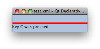
In the next example, a FocusScope is added to the component, and the visual result shown.
 FocusScope {
     width: 240; height: 25
     Rectangle {
         color: "lightsteelblue"; width: 240; height: 25
         Text { id: myText }
         Item {
             id: keyHandler
             focus: true
             Keys.onPressed: {
                 if (event.key == Qt.Key_A)
                     myText.text = 'Key A was pressed'
                 else if (event.key == Qt.Key_B)
                     myText.text = 'Key B was pressed'
                 else if (event.key == Qt.Key_C)
                     myText.text = 'Key C was pressed'
             }
         }
     }
 }
|
|
Conceptually focus scopes are quite simple.
- Within each focus scope one element may have Item::focus set to true. If more than one Item has the Item::focus property set, the first is selected and the others are unset, just like when there are no focus scopes.
- When a focus scope receives active focus, the contained element with Item::focus set (if any) also gets active focus. If this element is also a FocusScope, the proxying behaviour continues. Both the focus scope and the sub-focused item will have Item::activeFocus set.
So far the example has the second component statically selected. It is trivial now to extend this component to make it clickable, and add it to the original application. We still set a one of the widgets as focused by default, but from then on clicking the either one gives it focus.
 Rectangle {
     color: "red"; width: 240; height: 55
     MyClickableWidget {}
     MyClickableWidget { y: 30; focus: true }
 }
| FocusScope {
id: page; width: 240; height: 25
MyWidget { focus: true }
MouseArea { anchors.fill: parent; onClicked: { page.focus = true } }
}
|

When a QML item explicitly relinquishes focus (by setting its Item::focus property to false while it has active focus), the system does not automatically select another element to receive focus. That is, it is possible for there to be no currently active focus.
See the Keyboard Focus example for a demonstration of moving keyboard focus between multiple areas using FocusScope elements.
Advanced uses of Focus Scopes
Focus scopes allow focus to allocation to be easily partitioned. Several QML items use it to this effect.
ListView, for example, is itself a focus scope. Generally this isn't noticable as ListView doesn't usually have manually added visual children. By being a focus scope, ListView can focus the current list item without worrying about how that will effect the rest of the application. This allows the current item delegate to react to key presses.
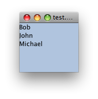
This contrived example shows how this works. Pressing the Return key will print the name of the current list item.
 Rectangle {
      color: "lightsteelblue"; width: 240; height: 320

      ListView {
          anchors.fill: parent
          focus: true

          model: ListModel {
              ListElement { name: "Bob" }
              ListElement { name: "John" }
              ListElement { name: "Michael" }
          }

          delegate: FocusScope {
              width: childrenRect.width; height: childrenRect.height
              TextInput {
                  focus: true
                  text: name
                  Keys.onReturnPressed: console.log(name)
              }
          }
      }
  }
|
|
While the example is simple, there's a lot going on behind the scenes. Whenever the current item changes, the ListView sets the delegate's Item::focus property. As the ListView is a focus scope, this doesn't effect the rest of the application. However, if the ListView itself has active focus this causes the delegate itself to receive active focus. In this example, the root element of the delegate is also a focus scope, which in turn gives active focus to the Text element that actually performs the work of handling the Return key.
All of the QML view classes, such as PathView and GridView, behave in a similar manner to allow key handling in their respective delegates.
Focus Panels
Traditional UIs are composed of many top-level windows. Windows actually perform two tasks - they act as the visual bounds for a widget, and they segment focus. Each window has a separate focused widget, that becomes (to mix terminologies) the active focus widget when the window is the active window.
### Focus panels do basically the same thing.


