Dialog icons are shown in pop-up dialog boxes that prompt the user for interaction. They use a light gradient and inner shadow in order to stand out against a dark background.
As described in Providing Density-Specific Icon Sets, you should create separate icon sets for low-, medium-, and high-density screens. This ensures that your icons will display properly across the range of devices on which your application can be installed. See Table 1 for a listing of the recommended finished icon sizes for each density. Also, see Tips for Designers for suggestions on how to work with multiple sets of icons.
Table 1. Summary of finished dialog icon dimensions for each of the three generalized screen densities.
|
|
|
|
|---|---|---|
| 24 x 24 px | 32 x 32 px | 48 x 48 px |
Final art must be exported as a transparent PNG file. Do not include a background color.
Templates for creating icons in Adobe Photoshop are available in the Icon Templates Pack.
The following guidelines describe how to design dialog icons for all versions of the Android platform.
|
Figure 1. Safeframe and fill gradient for dialog icons. Icon size is 32x32. |
Dialog icons are flat and pictured face-on. In order to stand out against a dark background, they are built up using a light gradient and inner shadow.
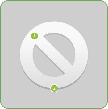
|
Figure 2. Light, effects, and shadows for dialog icons.
|
Step by step
|