Tab icons are graphical elements used to represent individual tabs in a multi-tab interface. Each tab icon has two states: unselected and selected.
As described in Providing Density-Specific Icon Sets, you should create separate icon sets for low-, medium-, and high-density screens. This ensures that your icons will display properly across the range of devices on which your application can be installed. See Tips for Designers for suggestions on how to work with multiple sets of icons.
Final art must be exported as a transparent PNG file. Do not include a background color.
Templates for creating icons in Adobe Photoshop are available in the Icon Templates Pack.
Warning:
The style of tab icons has changed drastically in
Android 2.0 compared to previous versions. To
provide support for all Android versions, developers should:
1. Place tab icons for Android 2.0 and higher in the
drawable-hdpi-v5, drawable-mdpi-v5, and drawable-ldpi-v5 directories.
2. Place tab icons for previous versions in
drawable-hdpi, drawable-mdpi, and drawable-ldpi directories.
3. Set android:targetSdkVersion to 5 or higher in the
<uses-sdk>
in the application manifest.
This will inform the system that it should render tabs using the new tab style.
Tab icons should have two states: unselected and selected. To provide icons with multiple states, developers must create a state list drawable for each an icon, which is an XML file that lists which image to use for the different UI states.
For example, for a tab widget with tabs named 'Friends' and 'Coworkers', you can use a directory structure similar to the one below:
res/...
    drawable/...
        ic_tab_friends.xml
        ic_tab_coworkers.xml
    drawable-ldpi/...
        ic_tab_friends_selected.png
        ic_tab_friends_unselected.png
        ic_tab_coworkers_selected.png
        ic_tab_coworkers_unselected.png
    drawable-mdpi/...
        ic_tab_friends_selected.png
        ic_tab_friends_unselected.png
        ic_tab_coworkers_selected.png
        ic_tab_coworkers_unselected.png
    drawable-hdpi/...
        ...
    drawable-ldpi-v5/...
        ...
    drawable-mdpi-v5/...
        ...
    drawable-hdpi-v5/...
        ...
The contents of the XML files listed above should reference the corresponding
selected and unselected icon drawables. For example, below is the code
for ic_tab_friends.xml:
<?xml version="1.0" encoding="utf-8"?>
<selector xmlns:android="http://schemas.android.com/apk/res/android">
    <!-- selected state -->
    <item android:drawable="@drawable/ic_tab_friends_selected"
          android:state_selected="true"
          android:state_pressed="false" />
    <!-- unselected state (default) -->
    <item android:drawable="@drawable/ic_tab_friends_unselected" />
</selector>
The following guidelines describe how to design tab icons for Android 2.0 (API Level 5) and later.
Tab icons should use simple shapes and forms and those must be scaled and positioned inside the final asset.
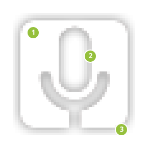
Figure 1 illustrates various ways of positioning the icon inside the asset. You should size the icons smaller than the actual bounds of the asset.
In order to indicate the recommended size for the icon, each example in Figure 1 includes three different guide rectangles:
|
|
|
|
|
|
|
Figure 1. Tab icon sizing and positioning inside the bounds of the icon asset. |
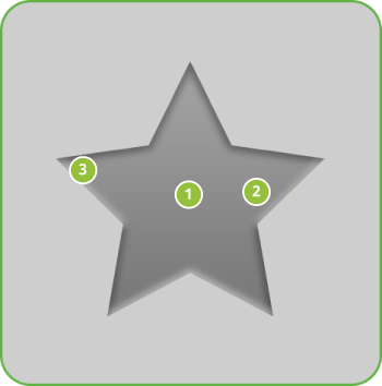
Tab icons are flat, matte, and pictured face-on.
Tab icons should have two states: selected and unselected.
|
Figure 2. Style and effects for unselected tab icons. Note: all pixel dimensions are for medium density and should be scaled appropriately for other densities.
|
|
Figure 3. Style and effects for selected tab icons. Note: all pixel dimensions are for medium density and should be scaled appropriately for other densities.
|
Below are some "do and don't" examples to consider when creating tab icons for your application.
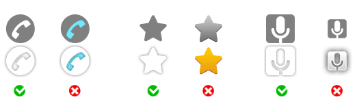
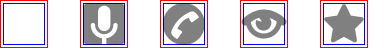
Shown below are standard high-density tab icons that are used in the Android platform.
Warning: Because these resources can change between platform versions, you should not reference the system's copy of the resources. If you want to use any icons or other internal drawable resources, you should store a local copy of those icons or drawables in your application resources, then reference the local copy from your application code. In that way, you can maintain control over the appearance of your icons, even if the system's copy changes. Note that the grid below is not intended to be complete.
The following guidelines describe how to design tab icons for Android 1.6 (API Level 4) and earlier.
|
Figure 3. Safeframe and fill gradient for unselected tab icons. Icon size is 32x32. |
|
Figure 4. Safeframe and fill gradient for tab icons in selected state. Icon size is 32x32. |
Unselected tab icons look just like the selected tab icons, but with a fainter inner shadow, and the same front part gradient as the dialog icons.
|
Figure 5. Light, effects, and shadows for unselected tab icons.
|
Step by step
|
The selected tab icons have the same fill gradient and effects as the menu icon, but with no outer glow.
|
Figure 6. Light, effects, and shadows for selected tab icons.
|
Color palette
|
Step by step
|