Through this tab, the properties of model elements selected in the explorer or editing pane may be set. The properties of an model element may be displayed in one of the following ways:
Selection of the model element in the explorer or editing panes, followed by selection of the properties tab in the details pane; or
Navigation buttons cause different model elements to be selected. I.e. the
Go Upbutton on the properties tab, theNavigate BackandNavigate Forwardbuttons in the main tool bar, and the various menu-items underEdit - Select.
Figure 13.6, “
A typical Properties tab on the
details pane
” shows a
typical properties tab for a model element in ArgoUML (in this case
a class).
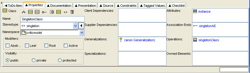
At the top left is the icon and name of the type of model element (i.e. the UML metaclass, not the actual name of this particular model element). In this example the property tab is for a class.
To the right of this is a toolbar of icons relevant to
this property tab. The first one is always navigation
Go up. The last is always Delete
to delete the selected model element from the model. The ones in
between depend on the model element.
The remainder of the tab comprises fields, laid out in two or three columns. Each field has a label to its left. The fields may be text boxes, text areas, drop down selectors, radio boxes and check boxes. In most (but not all cases) the values can be changed. In the case of text boxes this is sometimes by just typing the required value.
However for many text boxes and text areas, data entry is via a context sensitive pop-up menu (using button 2 click), which offers options to add a new entry, delete an entry or move entries up and down (in text areas with multiple entries).
The first field is almost always a text field
Name, where the name of the specific model element can be
entered. The remaining fields vary depending on the model element
selected.
The detailed property sheets for all ArgoUML model elements are discussed in separate chapters for each of the diagram types (use case diagram (Chapter 17, Use Case Diagram Model Element Reference , class diagram (Chapter 18, Class Diagram Model Element Reference , sequence diagram (Chapter 19, Sequence Diagram Model Element Reference , statechart diagram ( Chapter 20, Statechart Diagram Model Element Reference , collaboration diagram ( Chapter 21, Collaboration Diagram Model Element Reference , activity diagram ( Chapter 22, Activity Diagram Model Element Reference , deployment diagram ( Chapter 23, Deployment Diagram Model Element Reference ). Property sheets for model elements that are common to all diagram types have their own chapter (Chapter 16, Top Level Model Element Reference ).
![[Caution]](images/caution.png) | Caution |
|---|---|
ArgoUML will always try to squeeze all fields on to the property sheet. If the size of the property tab is too small, it may become unusable. The solution is to either enlarge the property tab by enlarging the main window, or by moving the dividers to left and top. |