As discussed earlier, attributes can influence how chart elements look like and how they are placed. There is a set of attributes that apply to several types of elements, so we describe them collectively here.
Attribute names are case-insensitive. Attributes can take
string, number or boolean values. String values shall be quoted
in double quotes (‘"’) if they contain non-literal characters or
spaces[26].
Quoted strings themselves can contain quotation marks by preceeding them
with a backslash ‘"’.
Numeric values can, in
general be floating point numbers (no exponents, though), but for some
attributes these are rounded to integers. Boolean values can be
specified via yes or no. The syntax
of color attributes is explained in Specifying Colors.
The attributes below can be part of a style, see Styles.
line.colorSpecifies the color of the line for the element. For arrows and dividers this is the horizontal line. For block arrows, boxes, pipes and entities this is the line around the element. Unless you use a single color name you must quote the color specification, see Specifying Colors for the syntax of colors.
line.widthSpecifies the width of the line.
line.typeSpecifies the type of the line. Its value can be
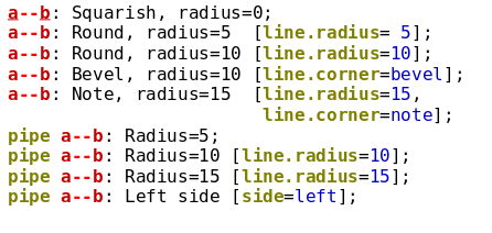
solid,dashed,dotted,doubleornone.line.radiusFor arrows it has effects only on arrows starting and ending in the same entity (see Arrow Attributes). For entities and boxes, this specifies the size of the corners. 0 is fully sharp, values are meant in pixels. If no
line.corneris specified setting radius to a positive value will result in round corners. For pipes, it specifies the width of the oval, in other words from how left we look at the pipe.line.cornerFor boxes and entities this attribute specifies how the corners of the box are drawn. Its value can be
none,round,bevel,note. It has no effect on other elements.
 |
 |
vline.*Specifies the color, width or type of the vertical line stemming from entities. This is useful to indicate some change of state for the entity.
vline.radiusandvline.cornerhas no effect. These attributes can be used for entities and dividers.fill.colorDefines the background color of the box, entity, block arrow or pipe. Specifying
noneresults in no fill at all. Unless you use a single color name you must quote the color specification, see Specifying Colors for the syntax of colors.fill.color2If this attribute is specified then the fill gradient will not be between
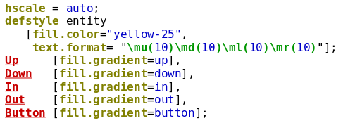
fill.colorand a lighter variant, but betweenfill.colorand the value specified here. If no gradient specified orbuttonis used, this attribute has no effect.fill.gradientDefines the gradient of the fill. It can take five values
up,down,in,outandbutton. The first two results in linear gradients getting darker in the direction indicated. The second two results in circular gradients with darker shades towards the center or edge of the entity box, respectively. The last one mimics light on a button.
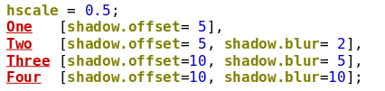
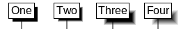
shadow.offsetIf not set to zero, then the entity or box will have a shadow (default is 0). The value of this attribute then determines, how much the shadow is offset (in pixels), in other words how "deep" the shadow is below the entity or box.
shadow.colorThe color of the shadow. This attribute is ignored if shadow.offset is 0. Unless you use a single color name you must quote the color specification, see Specifying Colors for the syntax of colors.
shadow.blurSpecifies how much the shadow edge is blurred (in pixels). E.g., if shadow.offset is 10 and shadow.blur is 5, then half of the visible shadow will be blurred. Blurring is implemented by gradually changing the shadow color’s transparency towards fully transparent. This attribute is ignored if shadow.offset is 0.
text.identThis can be
left,centerorrightand specifies the line alignment of the label. The default is centering, except for non-empty boxes, where the default is left. It can be abbreviated as simplyident.text.colorSets the color of the label. Unless you use a single color name you must quote the color specification, see Specifying Colors for the syntax of colors.
text.font.faceSpecify the font face family using this attribute, such as
ArialorHelvetica. The fonts available depend on the platform.text.font.typeSelect between normal or small font, superscript or subscript using the values
normal,small,superscriptandsubscript, respectively.bold,italic,underlineYou can set them to
yesorno.gap.up,gap.down,gap.left,gap.righThese four attribues can be used to set the margins around the label in pixels.
gap.spacingThis sets the line spacing in pixels.
size.normal,size.smallThese sets the height of the normal font type (see
text.font.typeabove) or the height of small, superscript and subscript, respectivel.text.formatTakes a (quoted) string as its value. Here you can specify any of the text formatting escapes that will govern the style of the label, see Text Formatting. Specifying them here or directly at the beginning of the label has the same effect, so having this attribute is more useful for styles.
text.link_formatSimilar to the above, you can specify the formatting applied to links. See Links.
text.wrapCan be set to
yesorno. If disabled (default), the label will follow the line breaks inserted by the user. If enabled, these line breaks are ignored and the line is typeset to fill available space, see Text Formatting.text.arrow.*Styles can also contain arrow formatting attribues. These are described in Arrow Attributes.
lost.text.*,lost.line.*,lost.arrow.*The values specified here will be added to the values of
text.*line.*orarrow.*when drawing the text, line or arrowheads of the lost part of the message, see Lost Messages. Only applicable for arrows.x.size,x.line.*The controls the appearance of the loss symbol for lost messages, see Lost Messages.
tag.line.*,tag.fill.*,tag.text.*These attribues applie only to boxes (applicable to the
box,emptyboxandbox_collapsedstyle) and govern the style of tags, if thetagattribute of the box is set. (Thetagattribute is not part of the style, you must set it individually on each box you want to have a tag.)shapeThis attribute takes the name of the shape you want for the entity headings. See Entity Shapes. They can be made part of style but have effect only on enities.
shape.sizeThis attribute specifies the size of the shape to use for the entity headings. Only has effect if a valid shape is specified via the
shapeattribute. It takes one oftiny,small,normal,bigorhugewithsmallas default. They can be made part of style but have effect only on entities.note.layout,note.posThese govern how notes are laid out. See Notes and Comments on how to use them. They can be made part of style but have effect only on notes.
sideThis attribute can take either
leftorright. For pipes it specifies which side the pipe can be looked from into. For verticals it tells which side the text can be read from. For comments it specifies which side of the chart the comment is placed on. It has no effect on any other elements.solidThis attribute can be used to set the transparency of a pipe. See Pipes for more information.
numberThis attribute giverns if the arrow, box, etc. is numbered or not. See Numbering for details.
compressIf this attribute is set to
yes, the element is drawn as close to the ones above it as possible without touching those. It is useful to save space, see Compression and Vertical Spacing for a detailed description.vspacingCan be set to a number interpreted in pixels or to the string
compress. Governs how much vertical space is added before the element (can be negative). This attribute is another form (superset) of thecompressattribute;compress=yesis equivalent tovspacing=compress, whereascompress=nois equivalent tovspacing=0.collapsedThis attribute can be used for group entities and boxes to collapse them.
indicatorIf this is set to yes on a collapsed group entity or box, indicators will show hidden entities and other chart elements.
The attributes below can be specified for most elements, but cannot be made part of a style
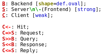
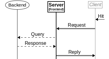
labelThis gives the label of the element (for elements having one). It can be abbreviated with the colon notation, see Labels.
urlThis assigns a link target to the label, such as an URL or a Doxygen target. Note that box tags cannot be turned into a link using this attribute, use the
\L()escape instead. See Links for more info.refnameUse this attribute to name the element for later reference. Used primarily to refer to elements via their numbers using the ‘
\r(name)’ escape in labels.draw_timeUse this attribute to draw elements earier or later and thereby control how they overlap. See more in Symbols.
parallelThis can take a
yesor anoand is equivalent to prepending the element with theparallelkeyword, see Parallel Blocks.
Styles are packages of attribute definitions with a name. Applying a style to any element can be easily done by simply stating the name of the style whereever an attribute is allowed, see the example below.
 |
 |
Styles can contain any of the attributes listed in the above section. If a style
contains an attribute not applicable for the element that you apply the style to,
that attribute is simply ignored. For example, applying a style with
fill.color=red attribute setting to an arrow, will ignore this attribute
since arrows take no fill attributes.
You can define your own styles or redefine existing ones. See Defining Styles for more on this.
Entities, arrows, boxes, pipes and dividers have a label attribute,
which specifies the text to be displayed for the element. Each element
displays it at a different place, but the syntax to describe a label is
the same for all.
For entities the label defaults to the name of the entity, while for the rest
it defaults to the empty string. Labels have to be quoted if they contain
any character other than letters, numbers, underscores and the dot, or if they
start with a dot or number or end with a dot.
You can use all character formatting features in labels, see Text Formatting.
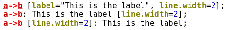
To avoid typing [label="..."] many times it is possible to specify
the label attribute in a simpler way.
After the definition of the element, just type a colon, the text of the label
unquoted and terminate with a semicolon (or opening brace ‘{’ or bracket
‘[’). You can write attributes before or after the label.
Thus all lines below result in the same text.
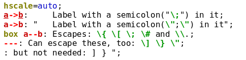
If the label needs to contain a
opening bracket (‘[’), opening brace (‘{’),
hashmark (‘#’) or a semicolon (‘;’) use quotations or
preceed these characters by a backslash ‘\’[27]. This is needed since these
characters would otherwise signal the end of the label (or the beginning of a
comment) If you want a real backspace, just type ‘\\’.
When using the colon notation, heading and trailing spaces are removed
from the label. If these are needed, place the entire label between two
quotation mark ‘"’[28].
 |
 |
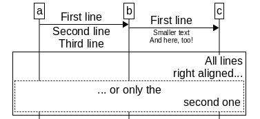
Labels can span multiple lines. You can insert a line break by adding the
‘\n’ escape sequence. Alternatively you can simply break a label and
continue in the next line. In this case leading and trailing whitespace is
removed from each line.
 |
 |
Arrows, boxes and dividers (any element with a label, except entities)
can be auto-numbered. It is a useful feature that allows easier
reference to certain steps in a procedure from explanatory text.
To assign a number to an element, simply set its number
attribute to yes. You can also assign a specific number,
in that case the element will get that number and subsequent elements
will be numbered (if they have number set to yes) from that
number upwards.
Notes and comments will not increase numbering, instead they carry the number of the element they are referring to. If the target element had no number comments will have none, even if numbering is turned on for them.
Styles can also control numbering. If a style has its number attribute
set to yes or no, any element that you assign the style to
will have its attribute set likewise. See Styles for more.
In order to minimize typing, the numbering chart option can be
used. It can be set to yes or no and serves as the default for
freshly defined elements. You can set the value of numbering at any
time and impact elements defined thereafter. You can use scoping to enable or
disable numberig for only blocks of the chart, see Scoping.
Most of the time you just declare numbering=yes at the beginning
of the chart and are done with it. However, if you want to control that only
some parts of the elements (e.g., only concrete messages and not boxes, for
example) got a number, you may need the other alternatives.
 |
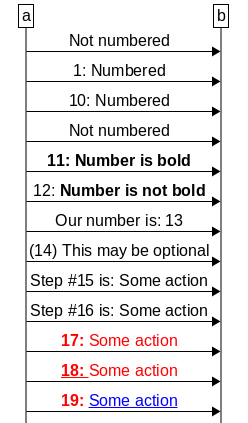 |
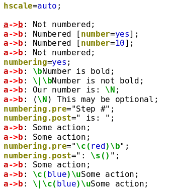
If numbering is turned on for a label, the number is inserted at the beginning of
the label and is followed by a semicolon and a space by default.
More precisely, the number is inserted
after any initial text formatting sequences, so that it has the
same formatting as the label itself (see Text Formatting)[29].
The above default can be changed by inserting the \N escape sequence
into a label.
This causes the number appear where the \N is inserted, as opposed
to the beginning of the label. In this case, the colon and the space is omitted,
only the number itself is inserted.
The colon and space can be changed to some other value by setting the
numbering.post chart option to the string you want to append to the number.
Similar, any string the numbering.pre option is set to will be
prepended to the number (empty by default). Both options are ignored when using
the \N escape sequence to set the label position.
Note that for the last two arrows formatting escapes were added to the
numbering.pre option. These are reversed by the ‘\s()’ escape
in the numbering.post option. See Text Formatting for more details.
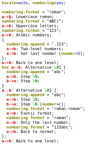
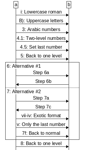
The format of the number can be set with the numbering.format chart option.
You can specify any of ‘123’, ‘iii’, ‘III’, ‘abc’, or
‘ABC’ for arabic, lowercase and uppercase roman numbers or lowercase and
uppercase letters, respectively[30]. You can also prepend
or append any text before or after the above strings, those will be prepended or
appended to the number (and will be included also when the number is inserted via
the ‘\N’ escape).
Note that the value of the numbering options is subject to scoping,
that is any change lasts only up to the next closing brace.
Note also, that when using roman numbers or letters, you can use such numbers as
the value of the number attribute, as shown below for ‘7c’.
It is also possible to have multi-level numbering (such as 1.1).
To achieve this, use the numbering.append chart option and specify
the format of the second level including any separator. Use the same format
as for numbering.format above.
It is possible to change the format of a multi-level label via the
numbering.format option. Simply use multiple of the number format
strings (such as ‘123’ or ‘roman’) as in the ‘Exotic format’ line of
the example above. If you use less number format strings than the current number
of levels (as in the ‘Only the last number’ line of the example),
Msc-generator displays only the end of the number, omitting levels from the top.
Those levels, however, are still maintained, just are not displayed.
The numbering.append option can only be used to add levels. There is no
explicit way to decrease the number of levels, you have to use scoping to achieve
that. On the example above, the second level appended in the scope of
‘Alternative #1’ is cancelled at the end of the scope, so we need to
append a second level also in ‘Alternative #2’, which then restarts from
‘a’.
 |
 |
Finally, if an element is named using the refname attribute, you can
reference the number of that element in another label using the \r(name)
escape sequence. Note that the value of the numbering.pre and
numbering.post options are ignored when inserting the number of a
referenced element, similar to how the \N escape inserts numbers.
Specifying an empty \r() escape inserts the number of the current element
and is thus equivalent to \N.
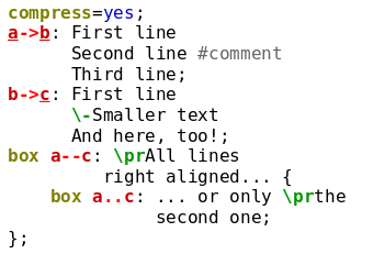
In this section we explain how Msc-generator sets the vertical space between
elements. It can apply a set amount of vertical space or can use the
compression mechanism. The latter aims to reduce the height of
chart graphics by vertically pushing chart elements closer to each other.
See the two examples below copied from the end of Defining Arrows.
They differ only in that the second begins with compress=yes.
 |
 |
Each element (except entities) has a compress and a vspacing
attribute. When the former is set to
yes, the element is first placed fully under the element before it, then
it is shifted upwards until it bumps into some already drawn element. The same
effect can be achieved by using vspacing=compress. If compression is not
used the element is placed below the previous element by the value of the
vspacing attribute (understood in pixels). E.g., using vspacing=10
adds 10 pixels between the element and the element before it. The
vspacing attribuite is the superset of the compress attribute,
setting compress to yes or to no is equivalent to
vspacing=compress and vspacing=0, respectively.
Compression and vertical spacing can be set individually for each element,
but to save typing by
setting the compress or vspacing chart option, you can effectively set the
compress or vspacing attribute of all elements after.
This is similar, how the
numbering chart option effects the number attribute. If you then
want to exempt specific elements from compression or add more space individually
(so that they are somewhat further from the element above),
just specify the compress or vspacing attribute for
the element in question.
Styles can also influence compression and vertical spacing
the same way as numbering, that is you can
set the compress or vspacing options for a style,
which will effect compression and vertical spacing of elements
you assign the style to.
Note that to insert extra vertical spacing you can also use the
vspace command, see Spacing.
[26] Specifically strings that contain characters other than letters, numbers, underscores or dots, must be quoted. If the string starts with a number or a dot or it it ends with a dot, it must also be quoted. The only exception to this are built-in style names, see Defining Styles.
[27] This character is often called the escape character making an escape sequence together with the character it follows.
[28] In this case there is no need to escape the
opening bracket or brace, the hashmark or the semicolon, since the end of the label
is clearly indicated by the terminating quotation mark. If, on the other hand
you need quotation marks in the label use ‘\"’. Also,
you cannot break the text in multiple lines in the input file, you have to
use the ‘\n’ escape to insert line breaks. This mode
is provided only for backwards compatibility.
[29] You can use the
\| formatting escape to insert a non-visible break into a stream of
formatting escapes. The number will be inserted there.
[30] Using ‘arabic’, ‘letters’ or
‘roman’ is also valid (both uppercase or lowercase).