Contents
| December, 2007 [Revision number: V6.0] |
This tutorial gives you a whirlwind tour of the visual veb application development in NetBeans IDE 6.0. The tutorial shows you how to use the IDE's Visual Web JSF Application functionality to perform the typical phases of web application development. The tutorial is designed so that you do not need to go through it in any particular order. You might want to skim over it quickly and then return to each section as time allows. If you prefer a step by step tutorial, you might want to first try Developing a JSF Web Application. |
This tutorial works with the following technologies and resources
| JavaServer Faces Components/ Java EE Platform |
||||
| Travel Database | ||||
* In order to take advantage of NetBeans IDE 6.0's Java EE 5 capabilities, use an application server that is fully compliant with the Java EE 5 specification such as the Sun Java Application Server 9/GlassFish.
This tutorial has been tailored for use with the GlassFish v2 Application Server. If you are using a different server, consult the Release Notes and FAQs for known problems and workarounds. For detailed information about the supported servers and Java EE platform, see the Release Notes.
A project is the equivalent of your working environment for a web application. When you create a Visual Web JSF Application project and you have specified GlassFish V2 or later as an application server in the NetBeans IDE, the IDE can create a web application based on Java EE 5 that uses JavaServer Faces 1.2 components. By default, the web application is created in a directory structure that conforms to the Java BluePrints project conventions for web applications.
Start the IDE by using the appropriate step from the following list:
Create a Visual Web JSF Application project:
Choose a server and Java EE version and click Next.
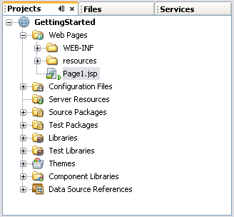
For example, the default server is GlassFish V2, and Java EE 5 is the default Java EE Version.Explore the Projects window. As shown in the following figure, the Projects window groups items by category. Expand each of the nodes to see what type goes in each category.
|
Figure 1: Projects Window |
Click the Files tab, or choose Window > Files from the main menu, to bring the Files window to the front. This window organizes the items by their physical storage. Expand the nodes to see the structure. Notice the badge ![]() that appears next to the ApplicationBean1.java node and several other nodes below it, such as Page1.java. This badge indicates that the file needs to be compiled. The IDE compiles the files automatically when you build the project.
that appears next to the ApplicationBean1.java node and several other nodes below it, such as Page1.java. This badge indicates that the file needs to be compiled. The IDE compiles the files automatically when you build the project.
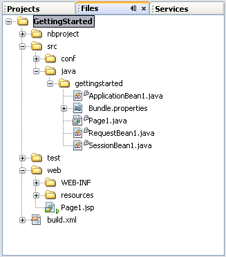
Figure 2: Files Window |
.jsp file and a .java file for the page. You learn more about .jsp and .java files in the next section. For More Information
With Visual Web JSF applications, you use JavaServer Pages (JSP) technology and page beans (also known as backing beans) instead of HTML pages. The JSP page is a template from which the server generates the HTML response to be displayed in the browser (the client). The page bean contains the logic that the server executes both when it generates the HTML response and after a user submits the page.
When you add a web page in a Visual Web JSF application, the IDE creates both a JSP file and a Java source file for you. You mostly use the Visual Designer and the Properties window to develop the web page. The IDE modifies the JSP code and Java code to implement what you design. Most of your work can be done from the Visual Designer and the Properties window.
Note: The JSP pages that the IDE generates are JSP documents. A JSP document is an XML document and, therefore, must be well-formed. While most JSP elements comply with XML syntax, there are some elements that are not XML compliant, such as comments, declarations, directives, expressions, and scriptlets. See the JavaServer Pages Syntax Reference for JSP document syntax.
In the Projects window, right-click the Web Pages node and choose New > Visual Web JSF Page, as shown in the following figure.
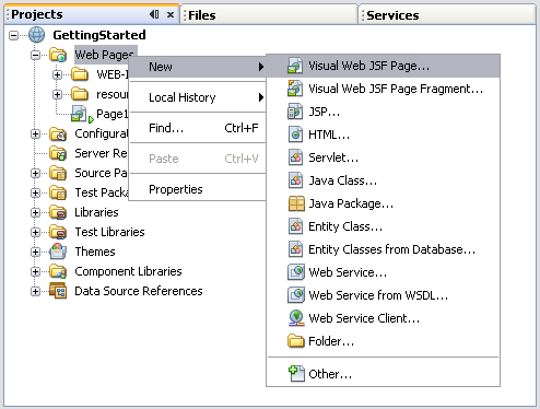
Figure 3: Right-Clicking the Web Pages Node |
Accept the default name of Page2 and click Finish. The IDE opens Page2 in the Visual Designer, which is in the editing area, as shown in the following figure.
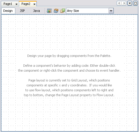
Figure 4: Visual Designer |
Click the Java button in the editing toolbar to see the source code for the page bean, as shown in the following figure. When the editing area shows the Java source, the Navigator window lists all the member fields and methods. Notice that the page's source code has methods to access the Application Bean, Session Bean, and Request Bean. See the Storing and Passing Data section in this tutorial for an explanation of these three types of beans.
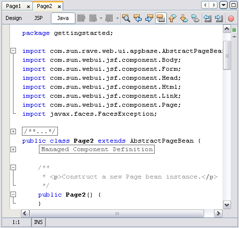
Figure 5: Java Source for Page Bean |
The source also has methods that get invoked during certain lifecycle events between the time the page is requested and the time the page rendering is complete.
Tip: Double-clicking a member in the Navigator window opens the source code editor and positions the cursor at that member's declaration. You can also click in the Navigator window and start typing the first few characters of a member's name to open a Quick Search dialog box. Continue typing until the IDE highlights the desired entry in the list, as shown in the following figure. You can then press Enter to open the source code editor and position it at the matching member's declaration.
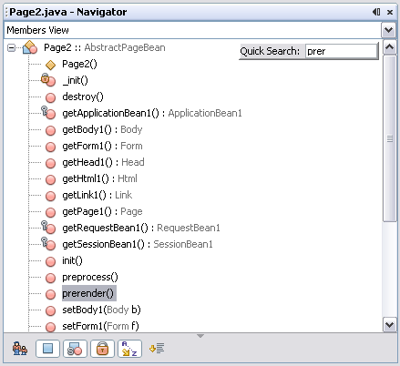
Figure 6: Quick Search in the Navigator Window |
Click the JSP button in the editing toolbar to see the JSP code for the page, as shown in the following figure. Notice how the JSP page uses JSP document syntax.
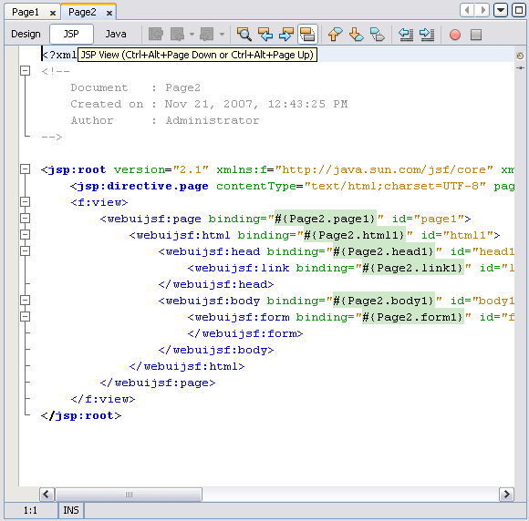
Figure 7: JSP View |
Clicking the Design button in the editing toolbar switches to the Visual Designer and displays the representation of the page in the Navigator window. If you open the nodes under the Page2 node, you can see the nodes shown in the following figure. Note how the tags in the JSP file are represented as nodes in the Navigator window.
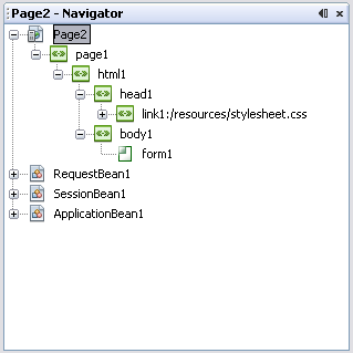
Figure 8: Navigator Window |
For More Information
You design a web page by dragging components from the Palette window and dropping them on the web page in the Visual Designer. The following figure shows Page2 with the Button, Text Field, Message, Drop Down List, and Radio Button Group components. All these components are available from the Basic section of the Palette. These components have been customized by changing their properties. You learn about properties later in this section.
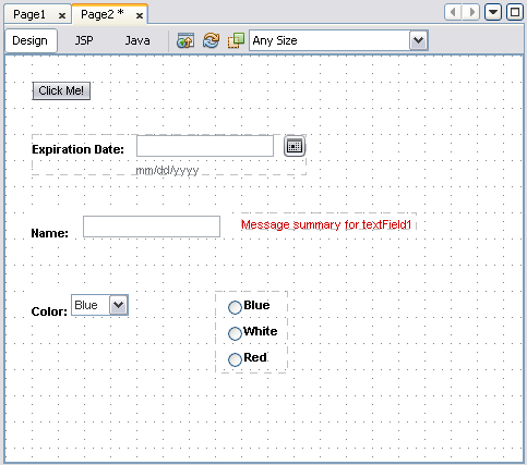
Figure 9: Components in the Visual Designer |
Note: The components that are available from the Palette are JavaServer Faces (JSF) components that have been enhanced according to the Design Time API to make their properties available for the Visual Designer and the Properties window. You can use other components in the web applications that you build by using the IDE, but you will not be able to use the interactive design-time features of the IDE on these components unless they have been customized according to requirements of the Design Time API. If the Java EE version is set to Java EE 5, the Palette offers JSF 1.2 components. If, when you create the project, you set the Java EE version to 1.3 or 1.4, the Palette offers JSF 1.1 components.
Most of the components that you use are in the Basic, Layout, and Composite sections of the Palette window. The following tables show some of the most commonly used components grouped according to functionality.
Table 1: Input Components
| Component | Description | Palette Section |
|---|---|---|
| Text Field | An input field for a single line of text. | Basic |
| Text Area | An input field for multiple lines of text. | Basic |
| Drop Down List | A drop-down menu, also referred to as a combo box. | Basic |
| Listbox | A list from which the user can select either one item or multiple items, depending on how the component is configured. | Basic |
| Checkbox | A single-character box that the user can either select (check) or clear. | Basic |
| Radio Button | A single radio button that the user can select (check). | Basic |
| Password Field | An input field that echoes the input characters with a replacement character to mask the input. | Basic |
| File Upload | A component with a text input field and a Browse button that displays a file chooser for specifying a file to upload. The application uploads the specified file when the user submits the page. | Basic |
| Add Remove | Two lists (one for available options, one for selected options) with buttons to move the options between the lists, and to order the selected options. | Composite |
| Calendar | An input field and calendar for chooseing dates. | Basic |
Table 2: Display Components
| Component | Description | Palette Section |
|---|---|---|
| Label | Text field that can be associated with an input field and for which you can specify a weak, medium, or strong font style. | Basic |
| Static Text | Field for displaying text. | Basic |
| Image | Inline image. | Basic |
| Message | Text field that is linked to a specific component for displaying validation errors and other messages about that component. | Basic |
| Message Group | Text field for displaying runtime error messages, program generated error messages, and, optionally, validation errors and other messages about components that are on the page. | Basic |
| Page Alert | Similar to an Alert component (below), but intended to display the icon and information on a separate page. | Layout |
| Alert | Displays an icon and informational text such as a warning, an error, or the successful completion of some event. | Composite |
| Hidden Field | An invisible field that can be used to hold data or pass information to the server. | Basic |
| Page Separator | A horizontal line that resizes to any page width selected by the user | Layout |
| Form | Used to add a form | Layout |
| Inline Help | Provides short help information that appears inline on your pages. | Composite |
Table 3: Grouping Components
| Component | Description | Palette Section |
|---|---|---|
| Checkbox Group | Displays two or more checkboxes in a grid layout. | Basic |
| Radio Button Group | Displays two or more radio buttons in a grid layout and ensures that only one button can be selected at a time. | Basic |
| Table, Table Row Group, and Table Column | Displays data from a composite data type such as a database table or an array. | Basic |
| Grid Panel | Organizes the components within a layout of rows and columns. | Layout |
| Group Panel | Groups a set of components in flow layout mode. | Layout |
| Layout Panel | Use to group a set of components in flow layout mode or grid layout mode. | Layout |
| Tab Set and Tab | Displays different layouts on the same page. Also can be used as a navigational tool. | Layout |
| Page Fragment Box | Groups components that you want to consistently display on two or more pages. | Layout |
| Property Sheet, Property Sheet Section, and Property | Lays out a single column of labeled components quickly, and divides the components into sections. | Layout |
| Breadcrumbs | Lays out a series of link components separated by right angle brackets (>). | Composite |
| Common Tasks Section, Common Tasks Group | A set of common tasks that users can perform | Composite |
Table 4: Action Components
| Component | Description | Palette Section |
|---|---|---|
| Button | Button that submits the associated form. | Basic |
| Hyperlink | Text field that submits a URL or submits a form. | Basic |
| Image Hyperlink | Image that submits a URL or submits a form. | Basic |
| Tab | Subcomponent of a Tab Set or a Tab. A tab can optionally submit a URL or submit a form. | Layout |
| Common Task | A link to a Visual web JSF page where a user can perform a task. | Composite |
You use the component's property sheet in the Properties window to change the appearance and behavior of the component, to bind the component to data, and to associate the component with event handlers.
The following figure shows the properties for a Listbox component.
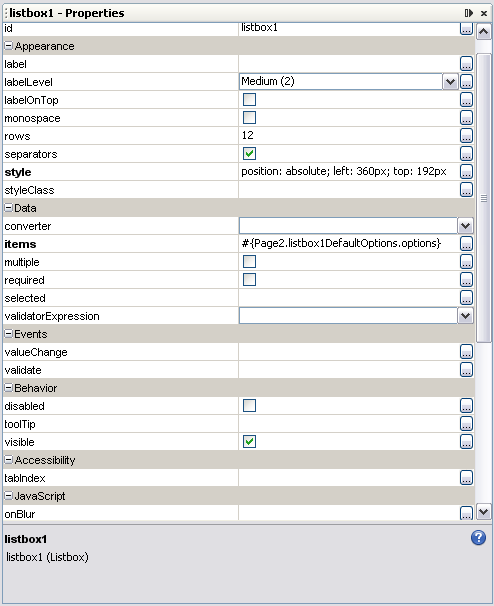
Figure 10: Listbox Properties in the Properties Window |
Try It
Open Page2 that you created by following the Try It suggestions in the Creating Web Pages section, or create it if necessary.
Click Me! and press Enter. In the Properties window, notice how the text property has the value Click Me!. In the Properties window, select the primary property's checkbox and notice how the button's appearance changes.Name: and press Enter. Ctrl-Shift-Click inside the Label component and drag to the Text Field component, and then release the mouse button. Select the Label component and notice how its for property is now set to the id for the Text Field Component. Set the labelLevel to Strong (1).for property for the Message component is now set to the id for the Text Field Component.label property to Color. Right-click the Drop Down List component and choose Configure Default Options to open the Options Customizer.Blue. Press tab twice and change Item 2 to White. Press tab twice more and change Item 3 to Green. Click OK and notice how your changes affect the component in the Visual Designer.Use similar steps to create a Radio Button Group component with the choices Blue, White, and Red, but do not close the Options Customizer quite yet.
In the Options Customizer, select the Select Items checkbox, and then select one of the radio buttons in the Selected column to set the default selection to that item. Click OK to apply the changes and to dismiss the Options Customizer. In the Properties window, set the columns property to 3 to align the radio buttons horizontally instead of vertically.For More Information
The IDE provides a Help Viewer, which contains help topics about the IDE. Also, when you press F1 on a window, dialog box, or Palette component, the Help viewer appears and displays information about that item. To access the Visual Web JSF Pack help topics, including help about the components, you can also choose Help > Help Contents from the main menu and scroll to Web Applications.
When you are ready to test a project, press F6 or choose Run > Run Main Project from the main menu. The IDE takes the following actions:
Compiles any files that need to be compiled.
If there are complications, the IDE displays the related error messages in the Output window (shown below) and does not continue with the build-and-run process. Click the link in the error message to go to the source code that caused the compilation error.Deploys the application to the application server.
If there are any complications, the IDE displays the related error messages in the Output window and does not continue with the build-and-run process.Opens a browser and sends the URL for the deployed application to the browser which, in turn, displays the start page.
Note: If you added components to a page other than the start page, at this point in the tutorial you will not see them in the web browser. See the Try It section below for a way to set up navigation from the start page to another page in your application.
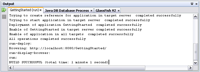
Figure 11: Output Window |
If you have made a lot of changes or deleted several items, or if you are seeing some unexpected behavior, you can choose Build > Clean and Build Main Project from the main menu. The IDE cleans out the project's build directory and dist directory, undeploys the web application, and then builds and deploys the application.
Next Page, and press Enter.url property, select a different page in the project, and click OK. Notice how the IDE sets the url property to /faces/page-name.jsp.Return to the IDE, and, in the Services window, expand Servers and expand the server's node, and then expand Applications > Web Applications and note that there is a node for your project, as shown in the following figure.
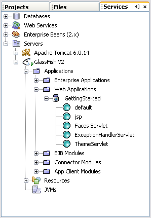
Figure 12: Deployed Web Applications |
For More Information
When a user types a URL, clicks a link, or clicks a button, the browser sends a request to the server. The server maps the request to a JSP page and uses that JSP page and its associated page bean to render a response.
You can specify page navigation in one of two ways:
url property to /faces/page-name.jsp. When you use the url property for navigation, the form data is not submitted. The web application simply navigates to the destination.To access the Page Flow editor, right-click the page background in the Visual Designer and choose Page Navigation.
The Page Flow editor shows page icons ![]() for all the pages in the project. When you click the + element of a page icon in the Page Flow editor, the icon expands and shows all its action components, components that have an action property, such as a Button, a Hyperlink, or a Tab. Next to each component is a connector port. In the image below the hyperlink's connector port resembles a chain and the button's shows an arrow. You drag from the connector port to a page icon to create the mapping between that action's request and the page to be rendered as a response to the request. When you release the mouse, the IDE adds a visual representation of that connection, as shown in the connection labeled nextPage in the following figure.
for all the pages in the project. When you click the + element of a page icon in the Page Flow editor, the icon expands and shows all its action components, components that have an action property, such as a Button, a Hyperlink, or a Tab. Next to each component is a connector port. In the image below the hyperlink's connector port resembles a chain and the button's shows an arrow. You drag from the connector port to a page icon to create the mapping between that action's request and the page to be rendered as a response to the request. When you release the mouse, the IDE adds a visual representation of that connection, as shown in the connection labeled nextPage in the following figure.
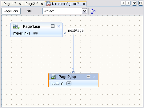
Figure 13: Page Flow Editor |
Note: When a page is submitted, the web application performs conversions and validations before it executes action methods. If a conversion or validation fails, the action methods do not get called. You should put Message Group components on a page during development so that you can catch any unexpected conversion or validation error that might prevent an action method from being invoked.
Next Page, and press Enter.Go, and press Enter.Double-click the Button component to access the button's action method.
Notice that the action method returns null. When an action method returns null, the application redisplays the page.nextPage and press Enter.go. In LinkPage2, double-click the Button component to access the button's action method.
Notice that the action method now returns the string "go". The mapping that you created in the Page Flow editor instructs the server to display LinkPage1.jsp whenever LinkPage2.jsp returns "go."For More Information
The IDE's Java editor is packed full of features to facilitate the programming process, many more than can be discussed in this introductory tutorial. If you click inside a Java editor window and press F1, you can get help on most of the features of this editor.
The following descriptions cover a few of the more useful editing features.
Code Completion. Code completion enables you to type a few characters and then choose from a list of possible classes, methods, variables, and so on to automatically complete the expression. To display the code completion box, press Ctrl-Space. The code completion box also appears when you pause after typing a period that follows a package name, a variable, or a method call, as shown in the following figure.
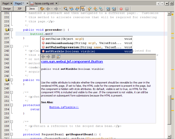
Figure 14: Code Completion Box |
Error detection. Red error boxes appear in the left margin of all statements that will not compile. Hover the mouse over the box to see the description of the error, as shown in the following figure. The IDE also displays an error strip on the right margin. This strip represents the whole file, not just the lines of code that are visible. Red lines in the error strip identify errors in the code. Double-click a red line to jump to the erroneous statement. When you compile files, all compilation errors appear in the Output window. Click an error message to display the erroneous code in the Java Editor.
Figure 15: Error Detection |
Java Editor Keyboard Shortcuts. You can invoke many common editing tasks with a simple key combination as shown in the following examples. To learn more about the shortcuts, choose Help > Help Contents from the main menu to open the Help viewer, and then in the Contents pane choose IDE Basics > Keyboard Shortcuts > Editor Shortcuts.
| Action | Shortcut |
|---|---|
| Format code | Alt-Shift-F |
| Remove current line | Ctrl-E |
| Move insertion point to highlighted matching bracket | Ctrl-[ |
| Select the block between a pair of brackets | Ctrl-Shift-[ |
Code Templates . Code Templates are short groups of characters that expand into a full word or phrase when you press the spacebar, as shown in the following examples. To see the full list of code templates, choose Tools > Options on a Microsoft Windows system or NetBeans > Preferences on a Macintosh system, and then choose Basic Options > Editor > Code Templates and click the ellipsis ![]() button for the Code Templates property. Some examples:
button for the Code Templates property. Some examples:
| Code | Abbreviation |
|---|---|
for (Iterator it = collection.iterator(); it.hasNext();) |
forc |
for (int i = 0; i < arr.length; i++) {} |
fori |
try {|} catch (Exception ex) |
trycatch |
Code Clips. When you have the Java editor open, the Palette window provides many useful code clips that you can drag and drop onto your source file. The code clips do not appear for managed bean source files, such as the source file for an application bean or a request bean.
Note: If you click JSP in the toolbar to open the JSP editor, you see JavaScript tooltips in the Palette window that you can use in the JSP file.Try It
Note: The following exercises have you type code in the destroy method. The code that you type is meant to illustrate the editing features. You would not normally put code like this in this method. After you complete the steps, you should remove the code.
destroy() to position the source code on that method. In the destroy() method, type getSessionBean1(). and pause. The Code Completion box appears. Type d to see the box narrow the list down to destroy(). Press Enter to use that selection. Press Ctrl-Space. Now type this.getH, and pause for the Code Completion box to appear. Move the cursor down to getHyperlink1() and press Enter. Type the period, pause for the Code Completion box, and type set. After the Code Completion box narrows the list to all methods that start with set, type te to narrow the list to setText(Object text) and press Enter. The IDE inserts setText() after the period and positions the cursor inside the parentheses. Type "hello", press End, and type ;.serr and press Tab to expand the abbreviation to System.err.println(""). Remove the semi-colon from the end of the line. Press F9 to compile the file. The Output window displays several links to errors. Click the first link that appears in the window. The IDE displays the statement that caused the error. Replace the semi-colon that you just removed.getSes and press Ctrl-K. The IDE replaces the string with the first matching word from the source code above the current line.destroy method body and press Ctrl-E to remove that line. Use Ctrl-E to remove the remaining lines in the method body.For More Information
The IDE provides validator and converter objects to facilitate input checking and formatting. These objects can be found in their respective sections in the Palette.
You bind a validator to an input component, such as a Text Field component, by dropping the validator onto the input component. For example, after you add a Text Field component to a page in the Visual Designer, you can drag a Length Validator from the Validators section in the Palette and drop it on the Text Field.
Alternatively, you can drop the validator onto the page and set the input component's validator property to that validator object. For example, you can drop a Long Range Validator on a blank spot on the page, which adds longRangeValidator1 to the Navigator window. You can then select an input component in the Visual Designer, such as the Text Field component, and choose longRangeValidator1 from its validatorExpression property's drop-down list. You can use the same validator for more than one component.
The mechanisms are similar for converters. You can also associate converters with output components, such as the Static Text component. Note that when you bind a component to a data provider field, the conversions are done automatically. You learn about binding to data providers in the Connecting to Databases section.
You use the validator's Properties window to set the validation rules, such as the minimum and maximum value or the minimum and maximum length. Similarly, you use the converter's Properties window to set the conversion rules, such as the pattern that the value should match or the method to call to do the validation. The Number converter has a special wizard that appears when you first drop the Number Converter onto the page or onto a visual component.
The Basic section of the Palette provides the Message component and the Message Group component for automatically displaying conversion errors, validation errors, and required-field messages. The Message Group component displays global error messages, runtime errors and, optionally, all the component error messages. A Message component displays only the messages for the component to which it is bound. You bind a Message component to another component by setting the Message component's for property or by pressing Ctrl-Shift on the Message component and dragging the mouse to the component to which you want to bind the Message component.
You can programmatically send custom error messages to the Message Group component using the error, warn, fatal, and info methods in any Page Bean. To learn more about these methods, choose Tools > Javadoc Index Search, type FacesBean in the text field for the drop-down list, and click Find.
Go.required property's checkbox.Price: and press Enter.for property. Note how the label in the Visual Designer shows an asterisk to indicate that input is required for its associated Text Field component. In the Palette, expand the Validators section. Drag a Double Range Validator and drop it on the Text Field component. In the Navigator window, select the newly created doubleRangeValidator1 node. In the Properties window for the validator, set the maximum to 10.0 and set the minimum to 1.0, as shown in the following figure.
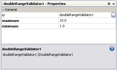
Figure 16: Double Range Validator Properties |
In the Palette, expand the Converters section. Drag a Number Converter and drop it on the Text Field component. A Number Format dialog box appears, as shown in the following figure. Select currency from the Type drop-down list, select English (United States) from the Locale drop-down list, and click OK.
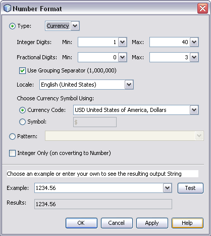
Figure 17: Number Format |
Add a Message component to the page. Press Ctrl-Shift on the component and drag to the Text Field component.
Notice that the IDE sets the Message component'sfor property to the Text Field component's id.Make the page the start page and run the application. Try clicking
the button with no price entered, with 1.5 entered,
with a non-numeric value, and with a price greater than $10.00.
Finally, type $1.50 in the text field and click the button.
showGlobalOnly checkbox for the Message Group component.For More Information
You use the Application Bean, the Session Bean, and the Request Bean to store information for use by other pages.
If you need the information only for use by the next page, use the Request Bean.
Any value that you store in the Request Bean disappears as soon as the request ends. A request is a single transmission of an HTTP request from the client to the server plus the corresponding response, which can be another page. In most cases, the request begins with the clicking of a button or a link, and ends with the response of an HTML page to be displayed.
Note: The Request Bean gets instantiated only if the page that initiates the request stores values in Request Bean properties, such as when an input component is bound to a Request Bean property as described below.
Warning: You cannot use the Request Bean if you have included the<redirect> element inside the <navigation-case> element of a navigation rule. (You see these rules when you click the Source button in the Page Flow editor.) When the page is submitted, the <redirect> element redirects the page and ends the request before a subsequent page can use any of the values stored in the Request Bean.To add a property to the Session Bean:
Double-click the SessionBean1 node in the Navigator window.
This opens SessionBean1.java in the Java Editor.answer property to the constructor public class SessionBean1 extends AbstractSessionBean.Right-click in the editor and choose Refactor > Encapsulate Fields. In the resulting dialog, create the getter method if the property is Read Only and both the getter and setter methods if the property is Read/Write.
The property appears as a subnode under SessionBean1 in the Navigator window, but usually not right away.Use similar steps to add a property to the Request Bean or the Application Bean. For more information see the FAQ How do I add properties to managed beans in NetBeans IDE 6.0?
Note: You can also add properties to a page bean (the backing bean that the IDE creates for each page). To add a property to a page bean, open the page's java code and add the propery declaration to the constructor public class Page1 extends AbstractPageBean, and encapsulate the fields as above. Page bean property values last only as long as the page bean is instantiated. For example, when the user clicks a Button component that rerenders the page (that is, the action method returns null), a new instance of that page bean is created, and the page bean's property values are reinitialized. If you want to pass a value to the postback, you can use Hidden Field components.
To associate a component with a bean's property, right-click the component and choose Bind to Data. In the Bind to Data dialog box, select the Bind to Object tab and choose the bean's property, as shown in the following figure.
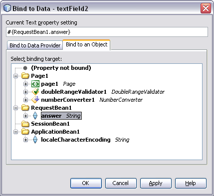
Figure 18: Bind to Data Dialog Box |
Note: For most components, the pop-up menu provides two binding actions - Property Bindings and Bind to Data. The Property Bindings dialog box enables you to bind any of the component's properties to a managed bean property or a data provider field. The Bind to Data dialog box is a shortcut for binding the component's value-holding property to a managed bean property or a data provider field. Use the Bind to Data Provider tab to bind to any data provider that you have added to the page or a managed bean. Use the Bind to an Object tab to bind to a page property or a managed bean property.
Add a property to RequestBean1.java: Name the property parm, make it a String and allow users read/write access.
For More Information
The Services window includes a Databases node, which shows all the databases that are registered with the IDE, as shown in the following figure. NetBeans IDE 6.0 provides a sample TRAVEL database which you use in the remainder of this tutorial.
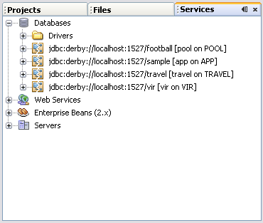
Figure 19: Data Sources |
Before you can access a database from a project, you must first connect the IDE to the database. You must do this every time you start the IDE and open a project that is connected to the database.
If a database's badge appears broken ![]() and you cannot expand the database's node, the IDE is not connected to the database. To connect to the TRAVEL database, right-click the database's node in the Services window and choose Connect from the pop-up menu. If the Connect dialog box appears, enter
and you cannot expand the database's node, the IDE is not connected to the database. To connect to the TRAVEL database, right-click the database's node in the Services window and choose Connect from the pop-up menu. If the Connect dialog box appears, enter travel for the Password and select Remember Password During This Session.
When you open an existing project, the Visual Designer might show an error screen. Typically, this is because the Visual Designer needs to get information from the database, but the IDE is not connected to the database. Try connecting to the database server and clicking the Continue button in the error screen to resolve the problem.
You can connect a page to a database table by dragging the table from the data sources section and either dropping it on a component or dropping it on the page. When you do this, the IDE adds a data provider to the page and a rowset to the SessionBean1 class, as shown in the following figure.
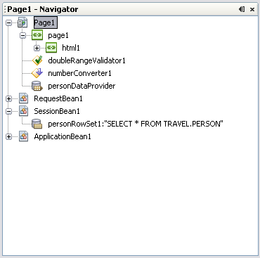
Figure 20: Data Provider and Row Set |
The rowset object makes the connection to the database, executes the queries, and manages the result set. The data provider object provides a common interface for accessing many types of composite data, from database tables, to ArrayList objects, to Enterprise JavaBeans objects. Typically, the only time that you work with the rowset object is when you need to set query parameters. In most cases, you use the data provider object to access and manipulate the data.
Once you have added a data provider to a project, you can bind a component to the data provider by right-clicking the component and choosing Bind to Data. In the Bind to Data dialog box, click the Bind to Data Provider tab to bring it to the front. The Choose a Data Provider drop-down list shows all the project's data providers from which you can select the data provider to bind to the component. After you select the data provider, choose the appropriate data column to be bound to the component. For some components, such as the Drop Down List component, you must choose both a Value field and a Display field.
To define the SQL query to use to retrieve the data, you use the Query Editor, as shown in the following figure. You access this editor through a rowset object.
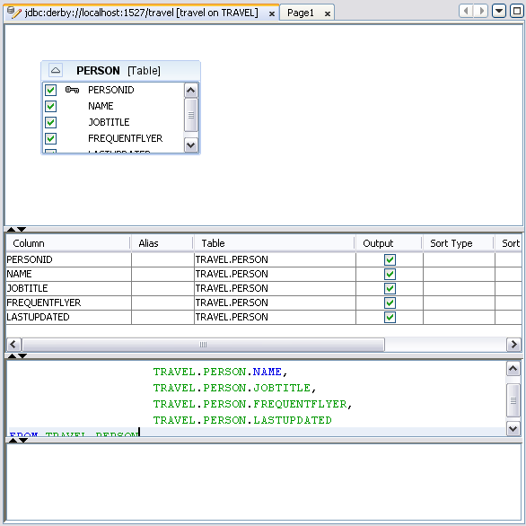
Figure 21: Query Editor |
Drag the TRIPTYPE node onto the page.
Note: If the TRAVEL database's badge is broken and you cannot expand the database's node, the IDE is not connected to the database. To connect to the TRAVEL database, right-click the databases node in the Services window and choose Connect from the pop-up menu. When the Connect dialog box appears, entertravel for the Password, select Remember Password During This Session, and click OK.(Optional) Look in the _init method in the page's Java source code to see the code for associating the data provider with the rowset. This method is folded by default. To unfold the code, click the code fold box that appears next to the left margin.
_init method to see how the rowset code implements the query. For More Information
The IDE has a built-in debugger to help you troubleshoot your programs, as shown in the following figure. You can use it to set breaks and watches, to step through code, and to run until it reaches the code statement that the cursor is on.
You set a breakpoint by clicking in the left margin of the Java Editor. You set a watch by right-clicking a variable or expression choosing New Watch. To run the debugger, choose either Run > Debug Main Project or Run > Run to Cursor from the main menu.
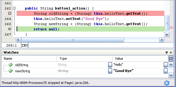
Figure 22: Debugger Window |
Tip: Here are some other features that you can use to diagnose and resolve problems:
error, warn, fatal, and info methods to display diagnostic messages in the component.log method to send diagnostic messages to the server log.text property to Hello, and set its id property to helloText. Add a Button component. Double-click the Button component to access its action method (button1_action) and replace the method's body with the following code.
| Code Sample 1: button1_action Method |
String oldString = (String) this.helloText.getText();
this.helloText.setText("Good Bye");
String newString = (String) this.helloText.getText();
return null;
|
Right-click oldString, choose New Watch, and click OK. Do the same for newString.
Click in the left margin to set a breakpoint for the first statement in the method's body.
You see a pink box appear where you clicked, and the entire line of code gets a pink background.button1_action method, click the Watches tab in the Debugger window to see the current value of newString and oldString. For More Information
url property values.