Using QML Positioner and Repeater Items
Introduction
Positioner items are container items that manage the positions and sizes of items in a declarative user interface. Positioners behave in a similar way to the layout managers used with standard Qt widgets, except that they are also containers in their own right.
Positioners and repeaters make it easier to work with many items when they need to be arranged in a regular layout.
Positioners
A set of standard positioners are provided in the basic set of Qt Quick graphical elements:
- Column arranges its children in a column
- Row arranges its children in a row
- Grid arranges its children in a grid
- Flow arranges its children like words on a page
Column
[Missing image qml-column.png]
Column items are used to vertically arrange items. The following example uses a Column item to arrange three Rectangle items in an area defined by an outer Item. The spacing property is set to include a small amount of space between the rectangles.
 import Qt 4.7

 Item {
     width: 310; height: 170

     Column {
         anchors.horizontalCenter: parent.horizontalCenter
         anchors.verticalCenter: parent.verticalCenter

         spacing: 5

         Rectangle { color: "lightblue"; radius: 10.0
                     width: 300; height: 50
                     Text { anchors.fill: parent
                            font.pointSize: 32; text: "Books" } }
         Rectangle { color: "gold"; radius: 10.0
                     width: 300; height: 50
                     Text { anchors.fill: parent
                            font.pointSize: 32; text: "Music" } }
         Rectangle { color: "lightgreen"; radius: 10.0
                     width: 300; height: 50
                     Text { anchors.fill: parent
                            font.pointSize: 32; text: "Movies" } }
     }
 }
Note that, since Column inherits directly from Item, any background color must be added to a parent Rectangle, if desired.
Row

Row items are used to horizontally arrange items. The following example uses a Row item to arrange three rounded Rectangle items in an area defined by an outer colored Rectangle. The spacing property is set to include a small amount of space between the rectangles.
We ensure that the parent Rectangle is large enough so that there is some space left around the edges of the horizontally centered Row item.
 import Qt 4.7

 Rectangle {
     width: 320; height: 110
     color: "#c0c0c0"

     Row {
         anchors.horizontalCenter: parent.horizontalCenter
         anchors.verticalCenter: parent.verticalCenter

         spacing: 5

         Rectangle { width: 100; height: 100; radius: 20.0
                     color: "#024c1c" }
         Rectangle { width: 100; height: 100; radius: 20.0
                     color: "#42a51c" }
         Rectangle { width: 100; height: 100; radius: 20.0
                     color: "white" }
     }
 }
Grid

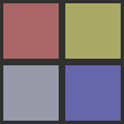
Grid items are used to place items in a grid or table arrangement. The following example uses a Grid item to place four Rectangle items in a 2-by-2 grid. As with the other positioners, the spacing between items can be specified using the spacing property.
 import Qt 4.7

 Rectangle {
     width: 112; height: 112
     color: "#303030"

     Grid {
         anchors.horizontalCenter: parent.horizontalCenter
         anchors.verticalCenter: parent.verticalCenter
         columns: 2
         spacing: 6

         Rectangle { color: "#aa6666"; width: 50; height: 50 }
         Rectangle { color: "#aaaa66"; width: 50; height: 50 }
         Rectangle { color: "#9999aa"; width: 50; height: 50 }
         Rectangle { color: "#6666aa"; width: 50; height: 50 }
     }
 }
There is no difference between horizontal and vertical spacing inserted between items, so any additional space must be added within the items themselves.
Any empty cells in the grid must be created by defining placeholder items at the appropriate places in the Grid definition.
Flow


Flow items are used to place items like words on a page, with rows or columns of non-overlapping items.
Flow items arrange items in a similar way to Grid items, with items arranged in lines along one axis (the minor axis), and lines of items placed next to each other along another axis (the major axis). The direction of flow, as well as the spacing between items, are controlled by the flow and spacing properties.
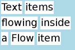
The following example shows a Flow item containing a number of Text child items. These are arranged in a similar way to those shown in the screenshots.
 import Qt 4.7

 Rectangle {
     color: "lightblue"
     width: 300; height: 200

     Flow {
         anchors.fill: parent
         anchors.margins: 4
         spacing: 10

         Text { text: "Text"; font.pixelSize: 40 }
         Text { text: "items"; font.pixelSize: 40 }
         Text { text: "flowing"; font.pixelSize: 40 }
         Text { text: "inside"; font.pixelSize: 40 }
         Text { text: "a"; font.pixelSize: 40 }
         Text { text: "Flow"; font.pixelSize: 40 }
         Text { text: "item"; font.pixelSize: 40 }
     }
 }
The main differences between the Grid and Flow positioners are that items inside a Flow will wrap when they run out of space on the minor axis, and items on one line may not be aligned with items on another line if the items do not have uniform sizes. As with Grid items, there is no independent control of spacing between items and between lines of items.
Repeaters

Repeaters create items from a template for use with positioners, using data from a model. Combining repeaters and positioners is an easy way to lay out lots of items. A Repeater item is placed inside a positioner, and generates items that the enclosing positioner arranges.
Each Repeater creates a number of items by combining each element of data from a model, specified using the model property, with the template item, defined as a child item within the Repeater. The total number of items is determined by the amount of data in the model.
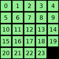
The following example shows a repeater used with a Grid item to arrange a set of Rectangle items. The Repeater item creates a series of 24 rectangles for the Grid item to position in a 5 by 5 arrangement.
 import Qt 4.7

 Rectangle {
     width: 400; height: 400; color: "black"

     Grid {
         x: 5; y: 5
         rows: 5; columns: 5; spacing: 10

         Repeater { model: 24
                    Rectangle { width: 70; height: 70
                                color: "lightgreen"

                                Text { text: index
                                       font.pointSize: 30
                                       anchors.centerIn: parent } }
         }
     }
 }
The number of items created by a Repeater is held by its count property. It is not possible to set this property to determine the number of items to be created. Instead, as in the above example, we use an integer as the model. This is explained in the QML Data Models document.
It is also possible to use a delegate as the template for the items created by a Repeater. This is specified using the delegate property.
Using Transitions
Transitions can be used to animate items that are added to, moved within, or removed from a positioner.
Transitions for adding items apply to items that are created as part of a positioner, as well as those that are reparented to become children of a positioner. Transitions for removing items apply to items within a positioner that are deleted, as well as those that are removed from a positioner and given new parents in a document.
Additionally, changing the opacity of items to zero will cause them to disappear using the remove transition, and making the opacity non-zero will cause them to appear using the add transition.
Other Ways to Position Items
There are several other ways to position items in a user interface. In addition to the basic technique of specifying their coordinates directly, they can be positioned relative to other items with anchors, or used with QML Data Models such as VisualItemModel.