Form Field: Multiple Choice
General Settings
| Field | Description |
|---|---|
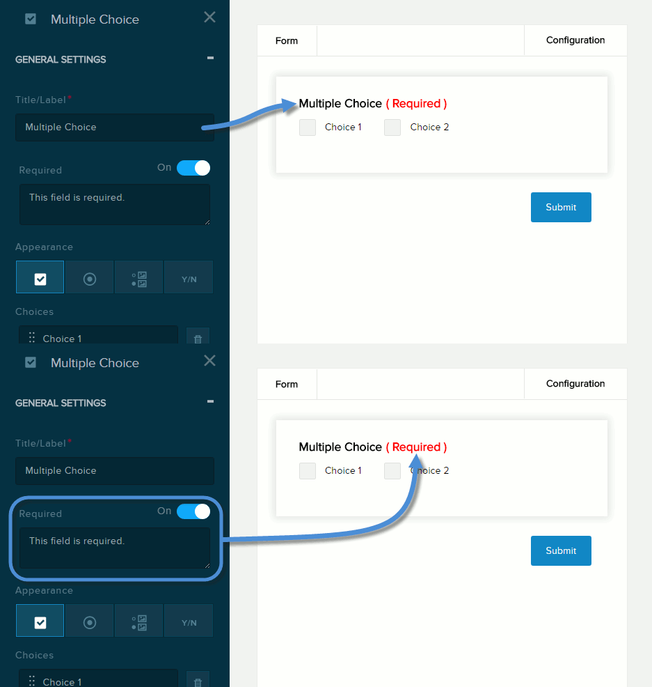
| Title/Label | Name of the field. You can change the name either in the General Settings panel or directly above the field on the canvas. |
| Required | If enabled (On),
|
| Field | Description |
|---|---|
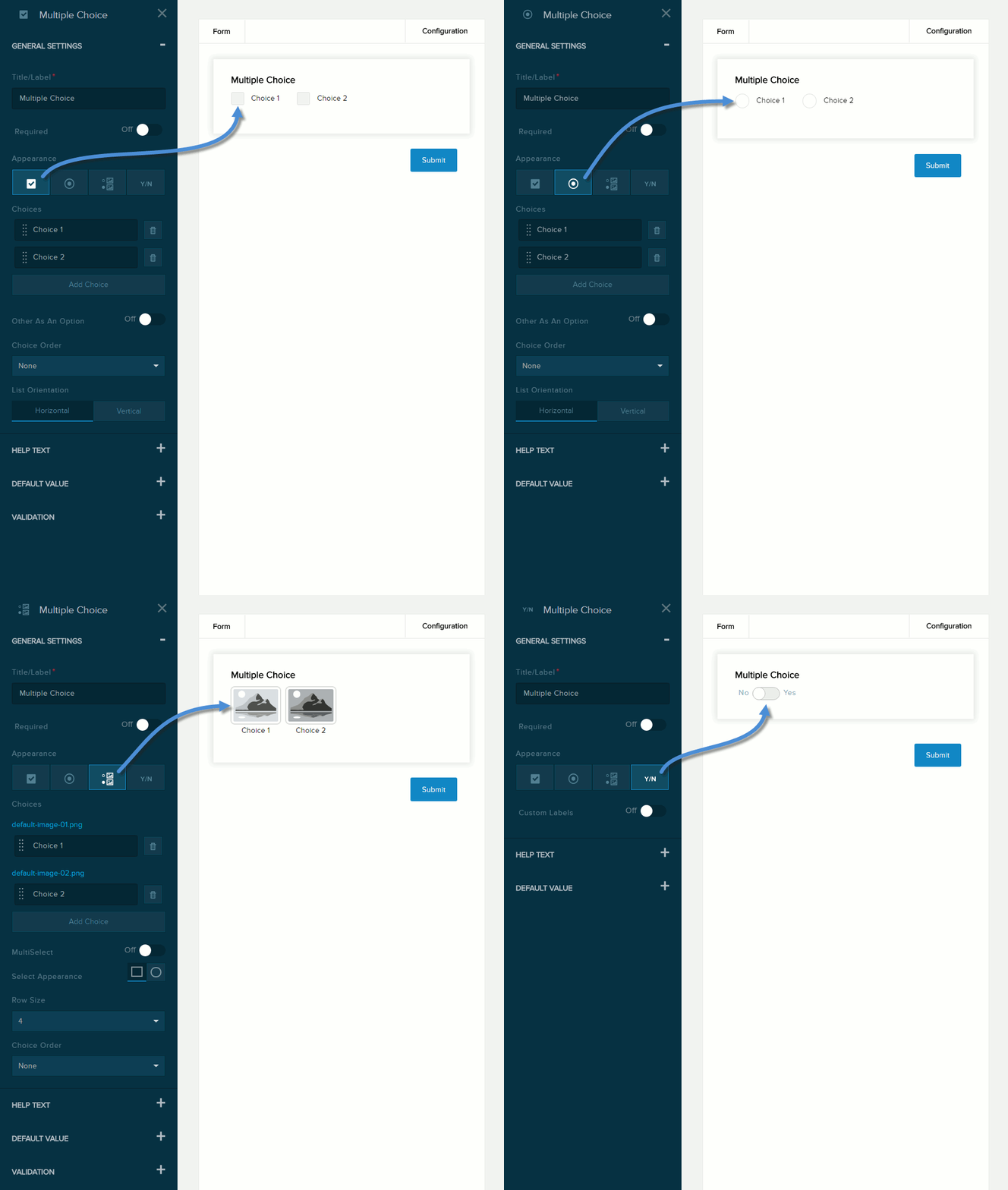
| Appearance |
|
| Field | Description |
|---|---|
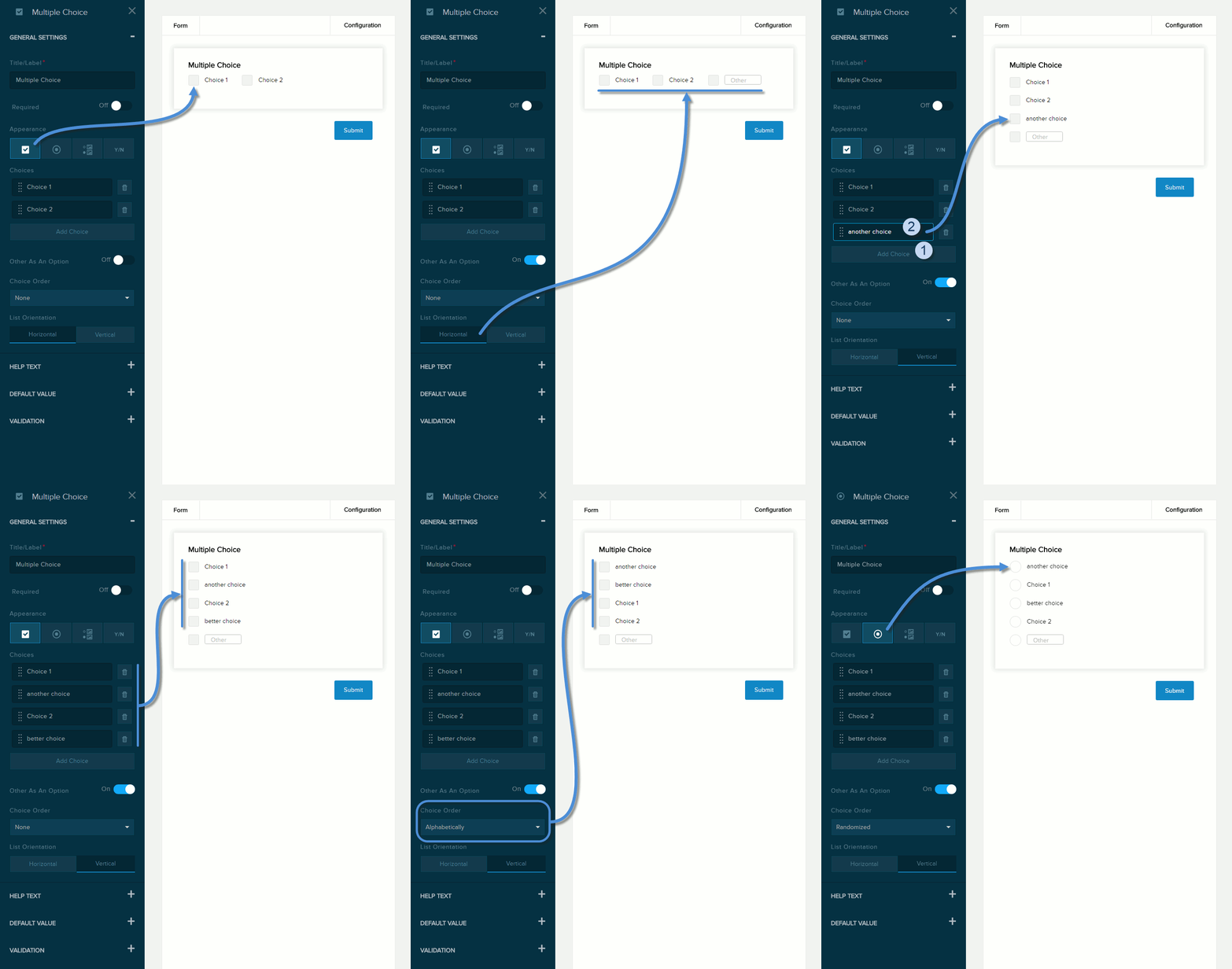
| Choices | The list of options.
|
| Other As An Option | If enabled (On), the user can enter a custom option in the text box and choose that option. |
| Choice Order |
|
| List Orientation |
|
| Field | Description |
|---|---|
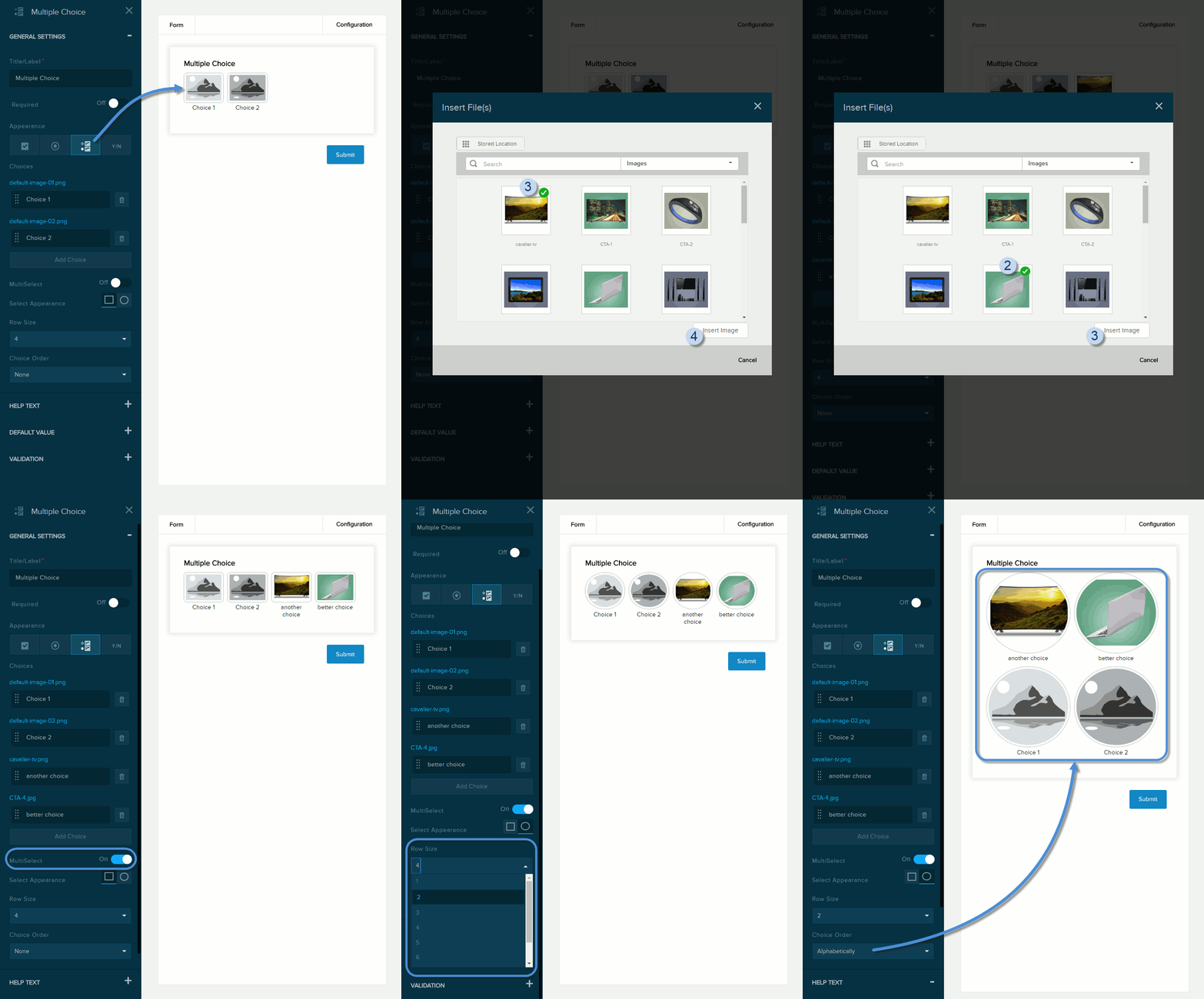
| Multiselect | If enabled (On), the user can choose one or more options. |
| Select Appearance | The shape of the images: square or circle. |
| Row Size | The number of images displayed in each row. |
| Field | Description |
|---|---|
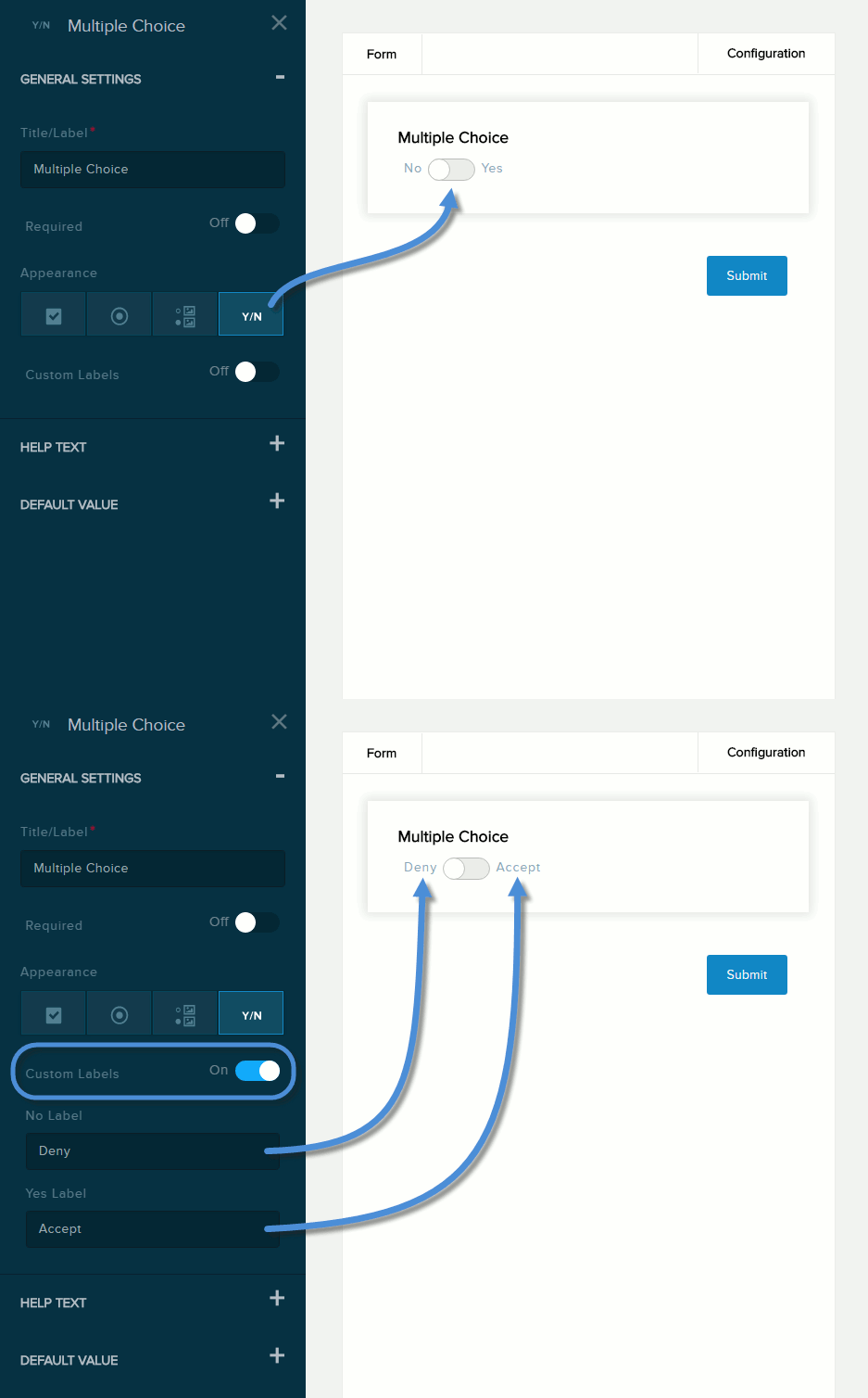
| Custom Labels | If enabled (On), you can replace the default No and Yes labels with the text you enter in the No Label and Yes Label fields, respectively. |
Help Text
| Field | Description |
|---|---|
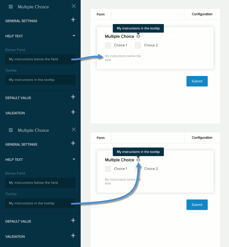
| Below Field | Help text to be displayed below the field. Maximum length: 140 characters. |
| Tooltip | If enabled (On) and the user hovers/clicks/taps over the information icon (i) next to the field name, displays the help text you enter in the provided text box. Maximum length: 140 characters. |
Default Value
| Field | Description |
|---|---|
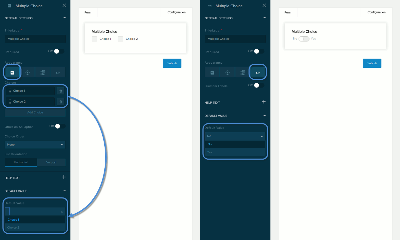
| Default Value | The value to assign to the field if the user does not provide a custom value. |
Validation
| Field | Description |
|---|---|
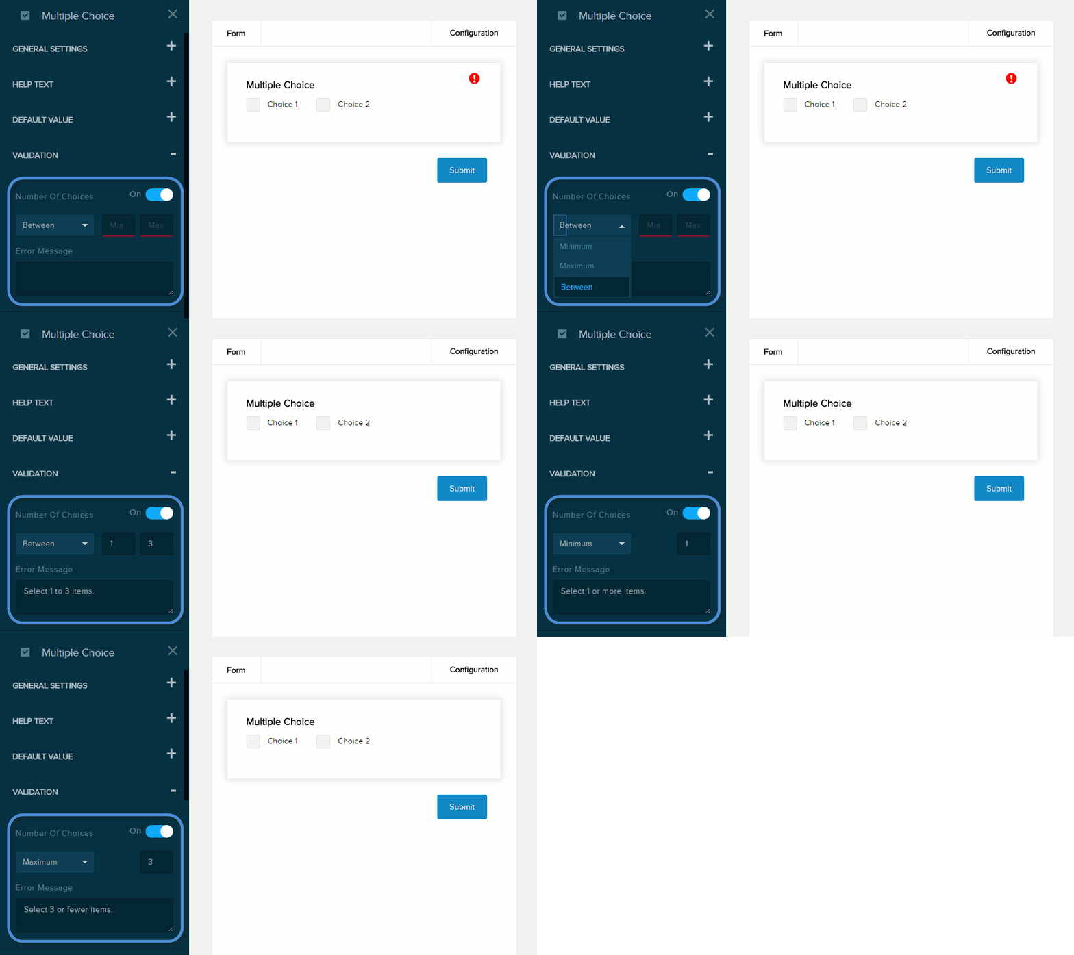
| Number of Choices | If enabled (On), the message you enter in the provided text box will be displayed if the user provides a value outside the valid range. You must indicate the valid range:
|
| Error Message | The message to display if the user entered data that does not meet the requirements for the field. |
