Form Field: Number
General Settings
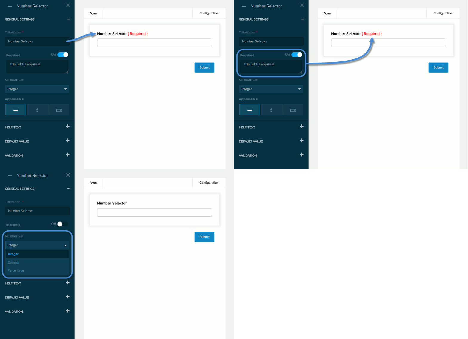
| Field | Description |
|---|---|
| Title/Label | Name of the field. You can change the name either in the General Settings panel or directly above the field on the canvas. |
| Required | If enabled (On),
|
| Number Set | The number type: Integer, Decimal, or Percentage. |
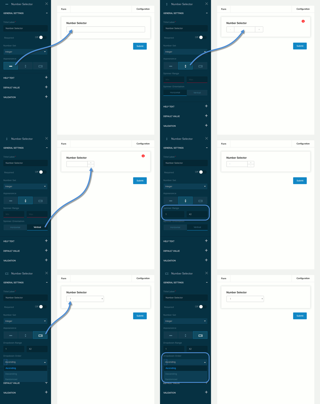
| Field | Description |
|---|---|
| Appearance |
|
|
Spinner Range Dropdown Range |
The numeric range that the field will allow. The numbers are incremented/decremented by 1 (if integers) or 0.1 (if decimals or percentages). |
| Spinner Orientation |
|
| Dropdown Order |
|
Help Text
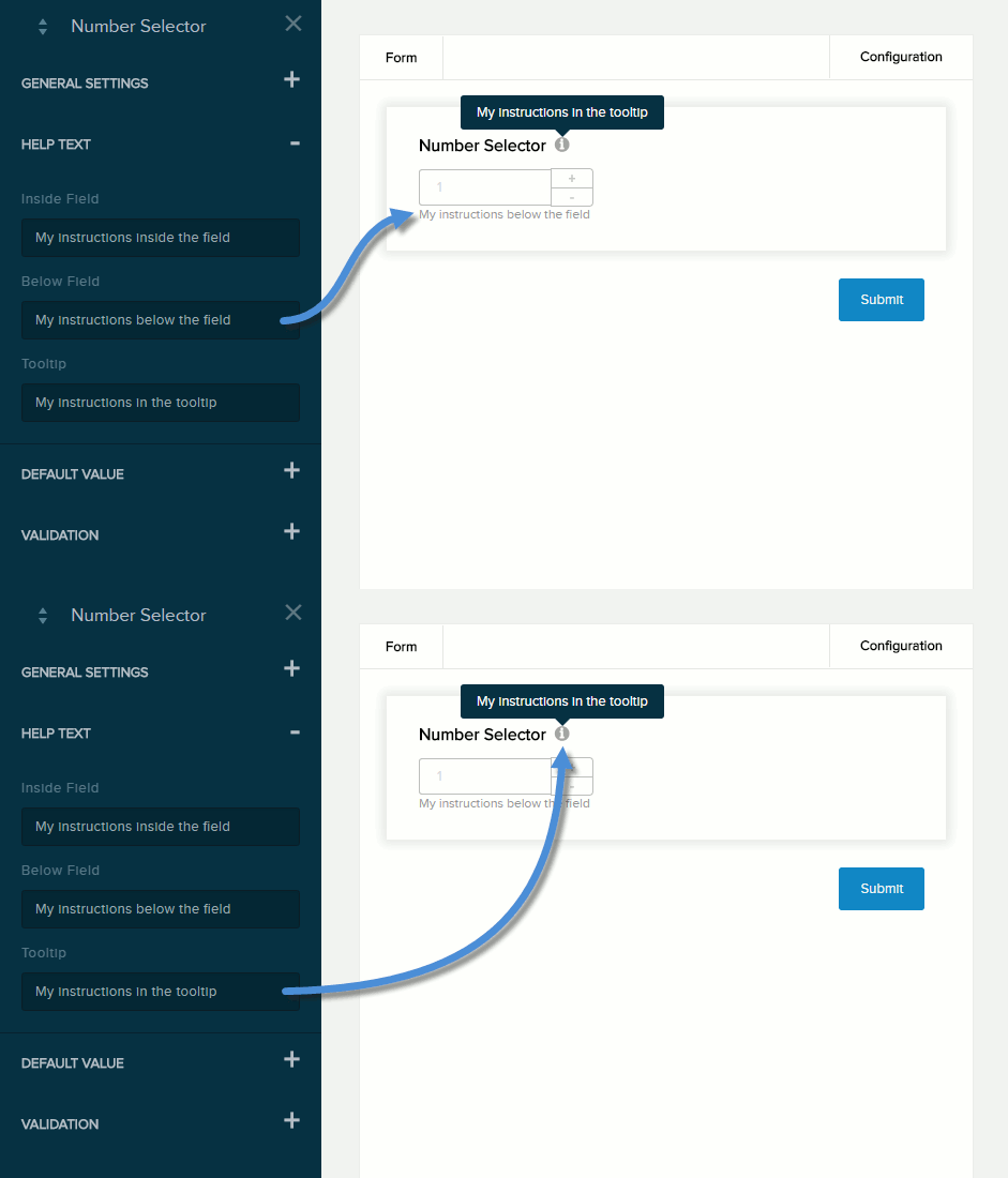
| Field | Description |
|---|---|
| Below Field | Help text to be displayed below the field. Maximum length: 140 characters. |
| Tooltip | If enabled (On) and the user hovers/clicks/taps over the information icon (i) next to the field name, displays the help text you enter in the provided text box. Maximum length: 140 characters. |
Default Value
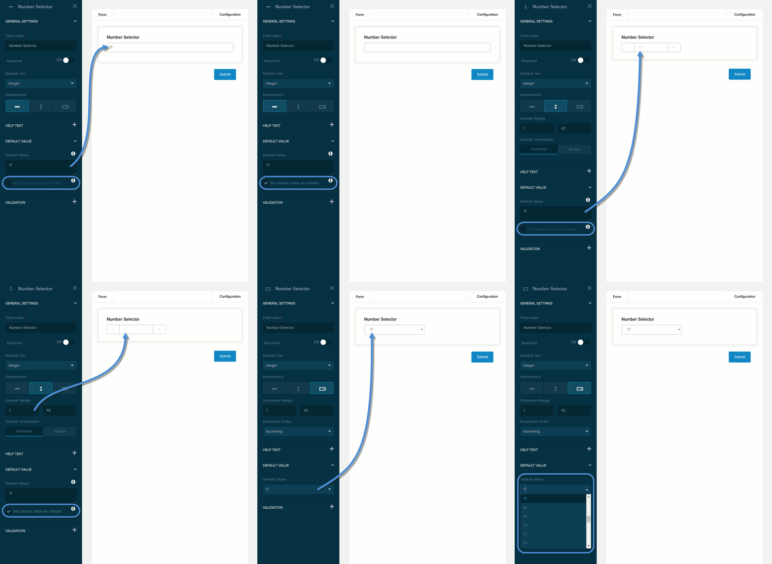
| Field | Description |
|---|---|
| Default Value | The value to assign to the field if the user does not provide a custom value.
Note: If using the spinner or dropdown appearance, specify the Min and Max of the range to populate this Default Value dropdown list, then select the default value.
|
| Set Default Value as Hidden | If checked,
|
Validation
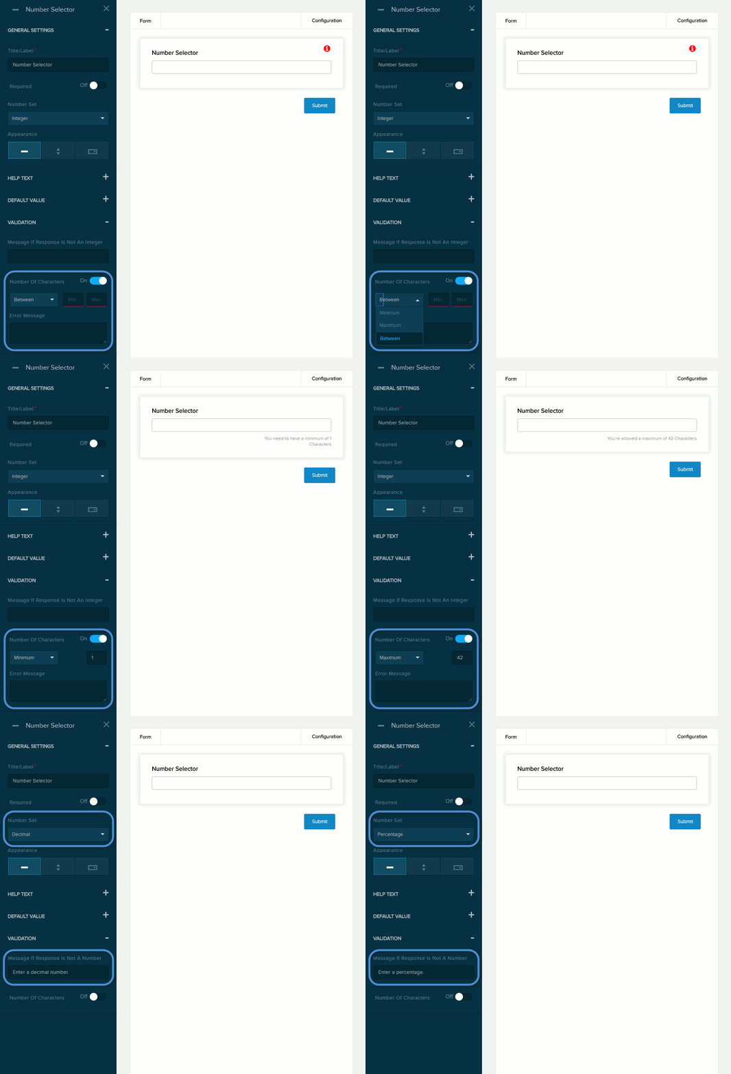
| Field | Description |
|---|---|
| Error Message | The message to display if the user entered data that does not meet the requirements for the field. |
| Number of Characters | If enabled (On), the message you enter in the provided text box will be displayed if the user provides a value outside the valid range. You must indicate the valid range:
|
