Stream Monitoring
Stream Monitoring provides information about how many messages were produced and consumed over time, highlighting any discrepancies between the two. It also provides statistics about how long it takes for messages to be consumed after production.
Chart Types
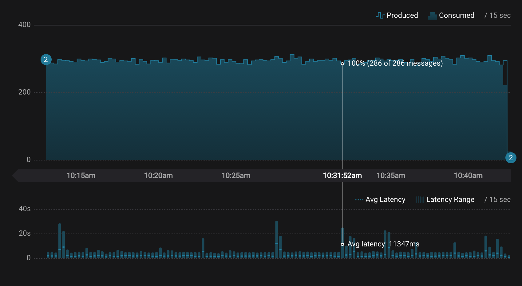
There are two chart types - one for visualizing message delivery (expected consumption compared with actual consumption counts) and one for visualizing latency (statistics on the time taken for messages to be consumed after production). These charts are always presented together, with the message delivery chart at the top and latency chart at the bottom.
All times referenced on the charts relate to the time at which messages were sent. More specifically, they are the timestamps included in Kafka messages added at the time messages were produced. By default, these timestamps will be generated by the Kafka Client, but an application may override them. For more information about the use of timestamps, refer to the Control Center Concepts.
All data presented by the charts are binned values. The bin size is uniform across all charts displayed at any given time and is annotated in the message delivery chart legend (in the above chart, the bin size is 15 seconds). The bin size is chosen dynamically to best match the data and display. It depends on time domain of the chart, browser window size and screen resolution.
The delivery chart shows the number of messages expected to be consumed in each time-bin as a step chart and the number of messages actually consumed as an area chart.
Note
Remember that the messages associated with a particular time-bin are those that were produced over the corresponding time range. The time at which messages were consumed never affects which time-bin they are associated with.
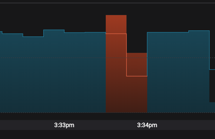
A gap between the “expected consumption” line and the “consumed” area indicates that some messages that were produced have not yet been consumed by a consumer group that is reading from the topic. Typically, there will be a gap between expected and actual consumption very close to real time, and this gap will diminish over time. (It takes some time for messages to move through a pipeline to be processed.) If a gap persists past one minute behind real time, Control Center will highlight the gap in orange to help draw your attention to it.
It’s also possible for more messages to be consumed than expected (this can happen in the case of consumer failure). In this case, the area chart will higher than the line chart for the affected time bin and the corresponding area on the chart will also be highlighted orange.
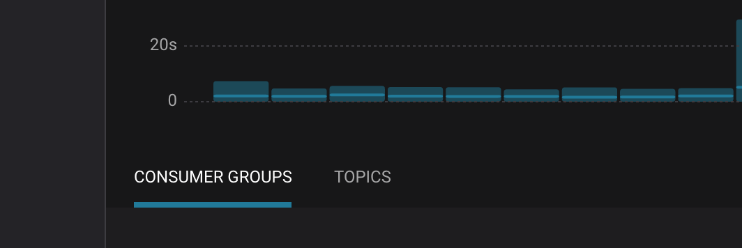
The latency chart shows the minimum latency, average latency, and maximum latency for messages sent within each time window. See Control Center Concepts for more details about how latency is calculated.
Page Layout
The stream monitoring page is split into two sections. The top section (aggregate view) provides a visualization of a specific subset of all messages and the bottom (detail view) a partitioning of this subset. The available views are:
- All messages, grouped by:
- Consumer group, or
- Topic
- A specific consumer group, grouped by:
- Consumer, or
- Topic / partition
- A specific consumer, grouped by:
- Topic / partition
Note
A consumer group may read from more than one topic, so the detail view of a specific consumer group or consumer may be comprised of topic / partitions from more than one topic.
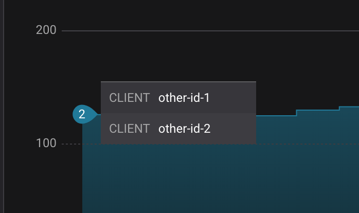
All charts on a given page show information corresponding to an identical time range. Hovering over any chart displays information pertinent to the time bin that the mouse is currently over across all charts. This allows for easy comparison of metrics across all charts.
Time Range and Cluster Selection
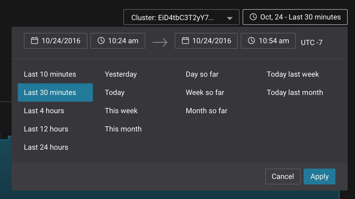
The current time range (which pertains to all charts shown on screen at any given time) is displayed inside a button at the top right hand side of the page. Clicking this button will open the time range selector:
You can use the selector to select one of three types of time ranges:
- Static - A specific time range with constant start and end times.
- Rolling - A time range where the end time always equal to the current time and the extent of the time range is held constant.
- Growing - A time range where the end time always equal to the current time and the start time is held constant.
Next to the time range selector is the cluster selector which allows you to choose which Kafka Cluster to display data for in a multi-cluster setting. Note that an aggregate view of all messages across all clusters is not available.
Summary statistics
Statistics summarizing the aggregate view data over the current visible time window are displayed near the top right of the screen.
Average latency is a weighted average (by consumed count) of the average latency over all visible time bins.
Overall completion is the sum of actual completion over all visible time bins as a percentage of the sum of expected completion over all visible time bins. This number can be greater than 100% in the case of over consumption.
If there is any under-consumption sufficiently behind real time (currently fixed at 1 minute behind real time, rounded up to the nearest bin size) an orange pin will be shown next to the overall consumption value to highlight this.
Note
It’s possible for both the orange pin to be visible and an overall consumption value to be greater than 100%. In this case there would have been both under and over consumption in different time bins, and greater over consumption than under consumption.
Missing Metrics Data
Lost or duplicate messages sent by your application can be seen as a difference between expected and actual consumption values in the message delivery chart.
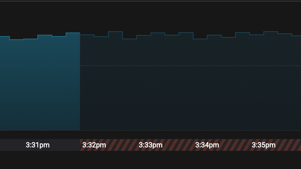
It’s also possible for messages sent by the Confluent metrics interceptors to be lost or duplicated. If this occurs, the affected time range is highlighted by showing a herringbone pattern on the axis. When interceptor data is lost, we can’t tell if any of your application messages were lost, delayed, or duplicated. (It is possible that they were lost, and also possible that they were not.)
Example Scenarios
In this section, we walk through some typical operational scenarios and discuss how they would show up in Stream Monitoring.
Adding a new Consumer Group
When a new consumer group starts reading messages from one or more topics, new pages will be available in Stream Monitoring corresponding to the new consumer group and it’s constituent consumers. Other aggregates will also start to incorporate information corresponding to the new group where appropriate.
There are a couple of details that warrant further discussion:
- Latencies associated with the consumption of existing messages.
- Change of expected consumption in existing aggregates.
Latency
Recall that latency is measured as the difference between the time a message was consumed and the timestamp associated with a message when it was produced.
If a new consumer group is configured to read messages that were produced before it’s creation (often from the first message available on a topic), latencies associated with these early messages could potentially be very high as the messages may have been produced a long time in the past. Also, the latencies will decrease with offset because messages with higher offsets will normally have more recent timestamps.
These factors will result in a descending triangle pattern in the latency charts of consumers in the new consumer group:
The latencies in any aggregate that includes the new consumers (all messages and relevant topic aggregates) will also be impacted. Note that when delivery latencies are very high, they will often dominate latencies in the existing aggregates, producing a decending triangle pattern in these aggregates as well.
Expected consumption
For the different types of aggregation, expected consumption over the duration of a particular time bucket is calculated as follows:
- Consumer - The total number of messages produced onto any topic / partition being read by the consumer over the duration of time bucket.
- Consumer Group - The total number of messages produced onto any topic being read by the consumer group over the duration of time bucket.
- Topic / Partition - The total number of messages produced onto the topic / partition over the durtion of time bucket. Note: this aggregation is always shown on a per consumer basis.
- Topic - The total number of messages produced onto the topic over the duration of the time bucket multiplied by the number of consumer groups that read messages from the topic corresponding to the duration of the time bucket.
- All messages - An aggregate of all Consumer Group aggregates. Also an aggregate of all Topic aggregates. (They are the same thing.)
When a new consumer group is created and starts reading messages from one or more topics, the all messages expected consumption aggregate will be affected, as will any relevant topic expected consumption aggregates.
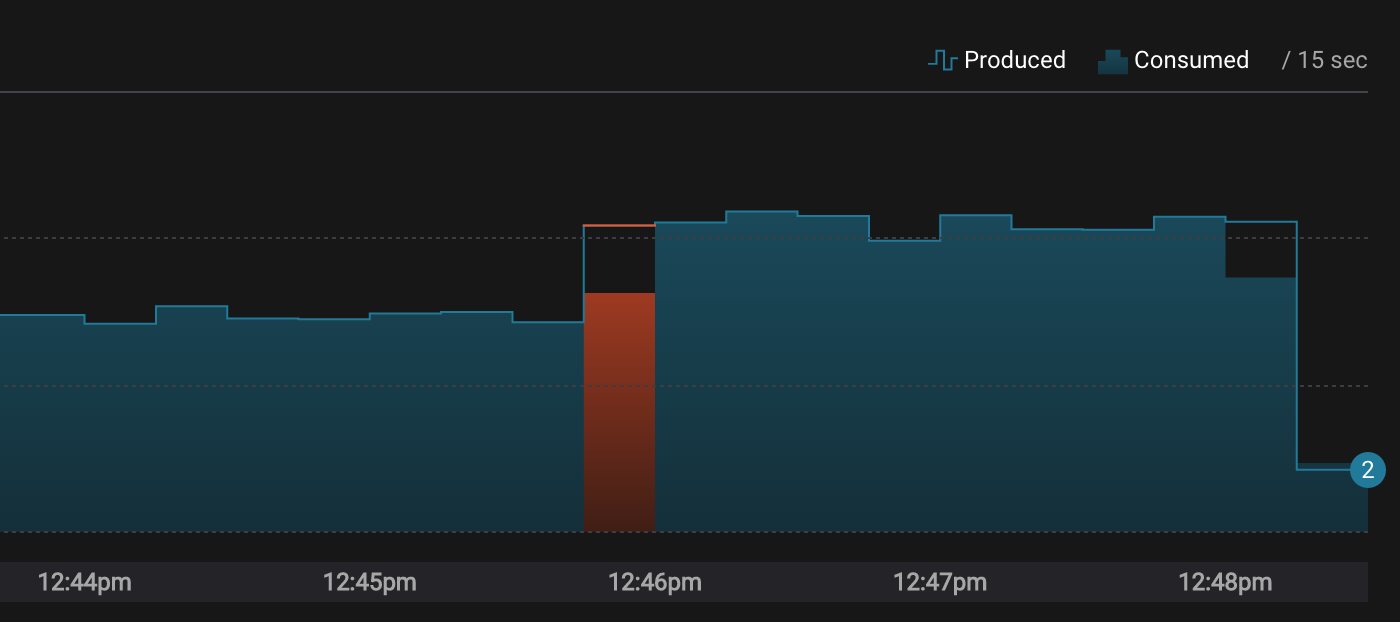
In the example below, two consumer groups were reading from a particular topic. At about 12:46pm, a new consumer group was started and began reading from the same topic (auto.offset.reset property was set to ‘latest’). Before the new consumer group was started, expected consumption from the topic is 2x the number of messages produced onto the topic. After the new consumer group started, expected consumption is 3x the number of messages produced onto the topic:
In general, the first message read by a consumer will not have a timestamp that aligns with a time bucket window. This causes Control Center to show under-consumption in the first time bucket after the new consumer group starts up because expected consumption is calculated as the total number of messages produced in the time window multiplied by the number of consumer groups that read any message that was produced in the time window.
Note
Control Center cannot differentiate between the scenario described above and an error scenario where there was unexpected under-consumption. For this reason, the under consumption associated with consumer group startup is highlighted in orange, even though it is a normal operational scenario.


