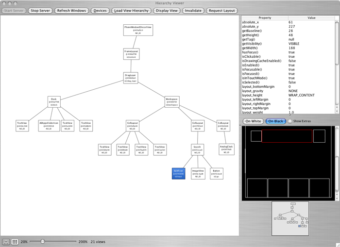
The Hierarchy Viewer application allows you to debug and optimize your user interface. It provides a visual representation of the layout's View hierarchy (the Layout View) and a magnified inspector of the display (the Pixel Perfect View).
To get the Hierarchy Viewer started:
hierarchyviewer from your SDK
/tools directory.
If you've navigated to a different window on the device, press Refresh Windows to refresh the list of available windows on the right.
The Layout View offers a look at the View layout and properties. It has three views:

Select a node in the Tree View to display the properties of that element in the Properties View. When a node is selected, the Wire-frame View also indicates the bounds of the element with a red rectangle. Double click a node in the tree (or select it, and click Display View) to open a new window with a rendering of that element.
The Layout View includes a couple other helpful features for debugging your layout:
Invalidate and Request Layout. These buttons execute the
respective View calls, invalidate() and requestLayout(),
on the View element currently selected in the tree. Calling these methods on any View can
be very useful when simultaneously running a debugger on your application.
The Tree View can be resized by adjusting the zoom slider, below the diagram. The number of View elements in the window is also given here. You should look for ways to minimize the number of Views. The fewer View elements there are in a window, the faster it will perform.
If you interact with the device and change the focused View, the diagram will not automatically refresh. You must reload the Layout View by clicking Load View Hierarchy.
The Pixel Perfect View provides a magnified look at the current device window. It has three views:
Click on an element in the Explorer View and a "layout box" will be drawn in the Normal View to indicate the layout position of that element. The layout box uses multiple rectangles, to indicate the normal bounds, the padding and the margin (as needed). The purple or green rectangle indicates the normal bounds of the element (the height and width). The inner white or black rectangle indicates the content bounds, when padding is present. A black or white rectangle outside the normal purple/green rectangle indicates any present margins. (There are two colors for each rectangle, in order to provide the best contrast based on the colors currently in the background.)
A very handy feature for designing your UI is the ability to overlay an image in the Normal and Loupe Views. For example, you might have a mock-up image of how you'd like to layout your interface. By selecting Load... from the controls in the Normal View, you can choose the image from your computer and it will be placed atop the preview. Your chosen image will anchor at the bottom left corner of the screen. You can then adjust the opacity of the overlay and begin fine-tuning your layout to match the mock-up.
The Normal View and Loupe View refresh at regular intervals (5 seconds by default), but the Explorer View does not. If you navigate away and focus on a different View, then you should refresh the Explorer's hierarchy by clicking Load View Hierarchy. This is even true when you're working in a window that holds multiple Views that are not always visible. If you do not, although the previews will refresh, clicking a View in the Explorer will not provide the proper layout box in the Normal View, because the hierarchy believes you are still focused on the prior View.
Optional controls include: