GUILayout.HorizontalSlider

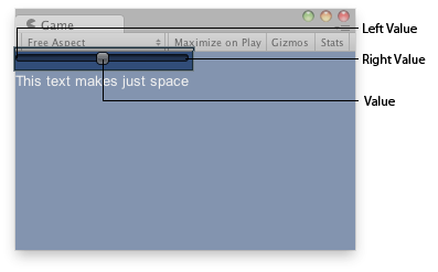
Horizontal slider in the GameView.
static
function
HorizontalSlider(value:
float,
leftValue:
float,
rightValue:
float,
params options:
GUILayoutOption[]):
float;
static float HorizontalSlider(float value,
float leftValue,
float rightValue,
params GUILayoutOption[] options);
static
def
HorizontalSlider(value as float,
leftValue as float,
rightValue as float,
*options as GUILayoutOption[])
as float
static
function
HorizontalSlider(value:
float,
leftValue:
float,
rightValue:
float,
slider:
GUIStyle,
thumb:
GUIStyle,
params options:
GUILayoutOption[]):
float;
Parameters
| value | The value the slider shows. This determines the position of the draggable thumb. |
| leftValue | The value at the left end of the slider. |
| rightValue | The value at the right end of the slider. |
| slider | The GUIStyle to use for displaying the dragging area. If left out, the horizontalSlider style from the current GUISkin is used. |
| thumb | The GUIStyle to use for displaying draggable thumb. If left out, the horizontalSliderThumb style from the current GUISkin is used. |
| options | An optional list of layout options that specify extra layouting properties. Any values passed in here will override settings defined by the style. |
Returns
float The value that has been set by the user.
float The value that has been set by the user.
Description
A horizontal slider the user can drag to change a value between a min and a max.

Horizontal slider in the GameView.
	var hSliderValue : float = 0.0;	function OnGUI () {
		hSliderValue = GUILayout.HorizontalSlider (hSliderValue, 0.0, 10.0);
                GUILayout.Label("This text makes just space");
	}
using UnityEngine;
using System.Collections;

public class Example : MonoBehaviour {
    public float hSliderValue = 0.0F;
    void OnGUI() {
        hSliderValue = GUILayout.HorizontalSlider(hSliderValue, 0.0F, 10.0F);
        GUILayout.Label("This text makes just space");
    }
}
import UnityEngine
import System.Collections

public class Example(MonoBehaviour):

	public hSliderValue as float = 0.0F

	def OnGUI() as void:
		hSliderValue = GUILayout.HorizontalSlider(hSliderValue, 0.0F, 10.0F)
		GUILayout.Label('This text makes just space')