GUILayout.HorizontalScrollbar
static
function
HorizontalScrollbar(value:
float,
size:
float,
leftValue:
float,
rightValue:
float,
params options:
GUILayoutOption[]):
float;
static float HorizontalScrollbar(float value,
float size,
float leftValue,
float rightValue,
params GUILayoutOption[] options);
static
def
HorizontalScrollbar(value as float,
size as float,
leftValue as float,
rightValue as float,
*options as GUILayoutOption[])
as float
static
function
HorizontalScrollbar(value:
float,
size:
float,
leftValue:
float,
rightValue:
float,
style:
GUIStyle,
params options:
GUILayoutOption[]):
float;
static float HorizontalScrollbar(float value,
float size,
float leftValue,
float rightValue,
GUIStyle style,
params GUILayoutOption[] options);
static
def
HorizontalScrollbar(value as float,
size as float,
leftValue as float,
rightValue as float,
style as GUIStyle,
*options as GUILayoutOption[])
as float
Parameters
| value | The position between min and max. |
| size | How much can we see? |
| leftValue | The value at the left end of the scrollbar. |
| rightValue | The value at the right end of the scrollbar. |
| style | The style to use for the scrollbar background. If left out, the horizontalScrollbar style from the current GUISkin is used. |
| options | An optional list of layout options that specify extra layouting properties. Any values passed in here will override settings defined by the style. |
Returns
float The modified value. This can be changed by the user by dragging the scrollbar, or clicking the arrows at the end.
float The modified value. This can be changed by the user by dragging the scrollbar, or clicking the arrows at the end.
Description
Make a horiztonal scrollbar.
A scrollbar control returns a float value that represents the position of the draggable "thumb" withtin the bar. You can use the value to adjust another GUI element to reflect the scroll position. However, most scrollable views can be handled more easily using a scroll view control.
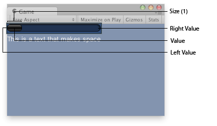
Horizontal Scrollbar in the Game View.

Horizontal Scrollbar in the Game View.
	var hSbarValue : float;	function OnGUI () {
		hSbarValue = GUILayout.HorizontalScrollbar (hSbarValue, 1.0, 0.0, 10.0);
                GUILayout.Label("This is a text that makes space");
	}
using UnityEngine;
using System.Collections;

public class Example : MonoBehaviour {
    public float hSbarValue;
    void OnGUI() {
        hSbarValue = GUILayout.HorizontalScrollbar(hSbarValue, 1.0F, 0.0F, 10.0F);
        GUILayout.Label("This is a text that makes space");
    }
}
import UnityEngine
import System.Collections

public class Example(MonoBehaviour):

	public hSbarValue as float

	def OnGUI() as void:
		hSbarValue = GUILayout.HorizontalScrollbar(hSbarValue, 1.0F, 0.0F, 10.0F)
		GUILayout.Label('This is a text that makes space')
The styles of the scroll buttons at the end of the bar can be located in the current skin by adding "leftbutton" and "rightbutton" to the style name.
The name of the scrollbar thumb (the thing you drag) is found by appending "thumb" to the style name.
	var scrollPos : float = 0.5;
	// This will use the following style names to determine the size / placement of the buttons
	// MyScrollbarleftbutton    - Name of style used for the left button.
	// MyScrollbarrightbutton - Name of style used for the right button.
	// MyScrollbarthumb         - Name of style used for the draggable thumb.
	function OnGUI() {
		scrollPos = GUILayout.HorizontalScrollbar (scrollPos, 1, 0, 100, "MyScrollbar");
	}
See Also: BeginScrollView, VerticalScrollbar.