GUILayout.SelectionGrid

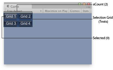
Selection grid in the Game View.
static
function
SelectionGrid(selected:
int,
texts:
string[],
xCount:
int,
params options:
GUILayoutOption[]):
int;
static int SelectionGrid(int selected,
string[] texts,
int xCount,
params GUILayoutOption[] options);
static
def
SelectionGrid(selected as int,
texts as string[],
xCount as int,
*options as GUILayoutOption[])
as int
static
function
SelectionGrid(selected:
int,
images:
Texture[],
xCount:
int,
params options:
GUILayoutOption[]):
int;
static int SelectionGrid(int selected,
Texture[] images,
int xCount,
params GUILayoutOption[] options);
static
def
SelectionGrid(selected as int,
images as Texture[],
xCount as int,
*options as GUILayoutOption[])
as int
static
function
SelectionGrid(selected:
int,
content:
GUIContent[],
xCount:
int,
params options:
GUILayoutOption[]):
int;
static int SelectionGrid(int selected,
GUIContent[] content,
int xCount,
params GUILayoutOption[] options);
static
def
SelectionGrid(selected as int,
content as GUIContent[],
xCount as int,
*options as GUILayoutOption[])
as int
static
function
SelectionGrid(selected:
int,
texts:
string[],
xCount:
int,
style:
GUIStyle,
params options:
GUILayoutOption[]):
int;
static int SelectionGrid(int selected,
string[] texts,
int xCount,
GUIStyle style,
params GUILayoutOption[] options);
static
def
SelectionGrid(selected as int,
texts as string[],
xCount as int,
style as GUIStyle,
*options as GUILayoutOption[])
as int
static
function
SelectionGrid(selected:
int,
images:
Texture[],
xCount:
int,
style:
GUIStyle,
params options:
GUILayoutOption[]):
int;
static int SelectionGrid(int selected,
Texture[] images,
int xCount,
GUIStyle style,
params GUILayoutOption[] options);
static
def
SelectionGrid(selected as int,
images as Texture[],
xCount as int,
style as GUIStyle,
*options as GUILayoutOption[])
as int
static
function
SelectionGrid(selected:
int,
contents:
GUIContent[],
xCount:
int,
style:
GUIStyle,
params options:
GUILayoutOption[]):
int;
static int SelectionGrid(int selected,
GUIContent[] contents,
int xCount,
GUIStyle style,
params GUILayoutOption[] options);
static
def
SelectionGrid(selected as int,
contents as GUIContent[],
xCount as int,
style as GUIStyle,
*options as GUILayoutOption[])
as int
Parameters
| selected | The index of the selected button. |
| texts | An array of strings to show on the buttons. |
| images | An array of textures on the buttons. |
| contents | An array of text, image and tooltips for the button. |
| xCount | How many elements to fit in the horizontal direction. The elements will be scaled to fit unless the style defines a fixedWidth to use. The height of the control will be determined from the number of elements. |
| style | The style to use. If left out, the button style from the current GUISkin is used. |
| options | An optional list of layout options that specify extra layouting properties. Any values passed in here will override settings defined by the style.See Also: GUILayout.Width, GUILayout.Height, GUILayout.MinWidth, GUILayout.MaxWidth, GUILayout.MinHeight, GUILayout.MaxHeight, GUILayout.ExpandWidth, GUILayout.ExpandHeight. |
Returns
int The index of the selected button.
int The index of the selected button.
Description
Make a Selection Grid.

Selection grid in the Game View.
	var selGridInt : int = 0;
	var selStrings : String[] = ["Grid 1", "Grid 2", "Grid 3", "Grid 4"];	function OnGUI () {
		selGridInt = GUILayout.SelectionGrid (selGridInt, selStrings, 2);
	}
using UnityEngine;
using System.Collections;

public class Example : MonoBehaviour {
    public int selGridInt = 0;
    public string[] selStrings = new string[] {"Grid 1", "Grid 2", "Grid 3", "Grid 4"};
    void OnGUI() {
        selGridInt = GUILayout.SelectionGrid(selGridInt, selStrings, 2);
    }
}
import UnityEngine
import System.Collections

public class Example(MonoBehaviour):

	public selGridInt as int = 0

	public selStrings as (string) = (of string: 'Grid 1', 'Grid 2', 'Grid 3', 'Grid 4')

	def OnGUI() as void:
		selGridInt = GUILayout.SelectionGrid(selGridInt, selStrings, 2)