GUILayout.BeginVertical
static
function
BeginVertical(params options:
GUILayoutOption[]):
void;
static void BeginVertical(params GUILayoutOption[] options);
static
def
BeginVertical(*options as GUILayoutOption[])
as void
static
function
BeginVertical(style:
GUIStyle,
params options:
GUILayoutOption[]):
void;
static void BeginVertical(GUIStyle style,
params GUILayoutOption[] options);
static
def
BeginVertical(style as GUIStyle,
*options as GUILayoutOption[])
as void
static
function
BeginVertical(text:
string,
style:
GUIStyle,
params options:
GUILayoutOption[]):
void;
static void BeginVertical(string text,
GUIStyle style,
params GUILayoutOption[] options);
static
def
BeginVertical(text as string,
style as GUIStyle,
*options as GUILayoutOption[])
as void
static
function
BeginVertical(image:
Texture,
style:
GUIStyle,
params options:
GUILayoutOption[]):
void;
static
def
BeginVertical(image as Texture,
style as GUIStyle,
*options as GUILayoutOption[])
as void
static
function
BeginVertical(content:
GUIContent,
style:
GUIStyle,
params options:
GUILayoutOption[]):
void;
static void BeginVertical(GUIContent content,
GUIStyle style,
params GUILayoutOption[] options);
static
def
BeginVertical(content as GUIContent,
style as GUIStyle,
*options as GUILayoutOption[])
as void
Parameters
| text | Text to display on group. |
| image | Texture to display on group. |
| content | Text, image, and tooltip for this group. |
| style | The style to use for background image and padding values. If left out, the background is transparent. |
| options | An optional list of layout options that specify extra layouting properties. Any values passed in here will override settings defined by the style.See Also: GUILayout.Width, GUILayout.Height, GUILayout.MinWidth, GUILayout.MaxWidth, GUILayout.MinHeight, GUILayout.MaxHeight, GUILayout.ExpandWidth, GUILayout.ExpandHeight. |
Description
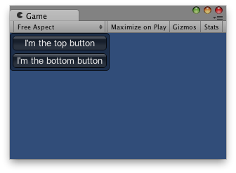
Begin a vertical control group.
All controls rendered inside this element will be placed vertically below each other. The group must be closed with a call to EndVertical.
Vertical Layout.

Vertical Layout.
	function OnGUI () {
		// Starts a vertical group
		GUILayout.BeginVertical ("box");		GUILayout.Button ("I'm the top button");
		GUILayout.Button ("I'm the bottom button");

		GUILayout.EndVertical();
	}
using UnityEngine;
using System.Collections;

public class Example : MonoBehaviour {
    void OnGUI() {
        GUILayout.BeginVertical("box");
        GUILayout.Button("I'm the top button");
        GUILayout.Button("I'm the bottom button");
        GUILayout.EndVertical();
    }
}
import UnityEngine
import System.Collections

public class Example(MonoBehaviour):

	def OnGUI() as void:
		GUILayout.BeginVertical('box')
		GUILayout.Button('I\'m the top button')
		GUILayout.Button('I\'m the bottom button')
		GUILayout.EndVertical()